11 Trendy Kitchen Paint Colors To Try In 2026
We may receive a commission on purchases made from links.
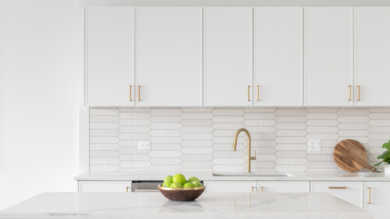
Countless kitchen palette trends have come and gone over the years. Some designs may be gone for good, but there are certain vintage kitchen design trends we want to bring back, such as colorful cabinetry — and we aren't the only ones who think so. Numerous paint brands have announced their choices for the 2026 color of the year that you might want to consider for your own home, including some hues that might surprise you.
From Sherwin-Williams to Little Greene, paint brands of all repute are offering a mixture of light and dark colors as their choices for the top kitchen and home trends in the coming year. You may want to use some of these on your cabinets and others on your walls, but regardless of which you choose, all of these options will give you the opportunity to let your personality shine in your kitchen, whether you're designing it for the first time or remodeling it for the third.
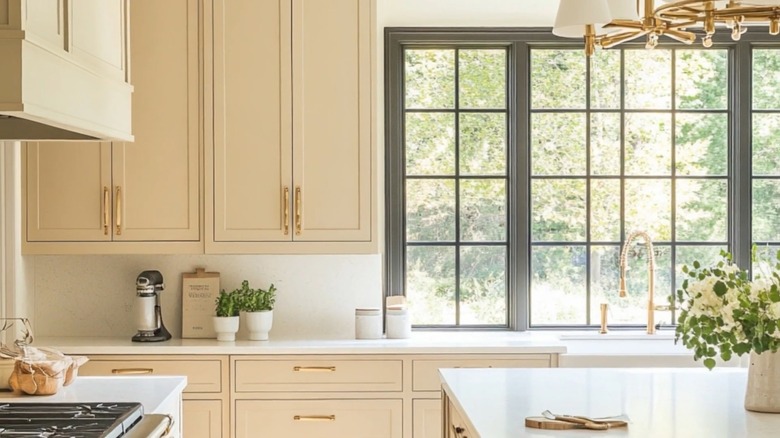
Universal Khaki from Sherwin-Williams
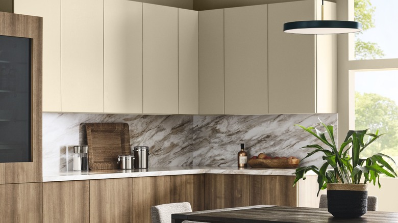
Sister brands Sherwin-Williams and HGTV Home by Sherwin-Williams have collaborated to choose a color of the year. Universal Khaki is a warm neutral that the company's color experts selected for its longevity and timelessness, as well as its versatility. It's part of the Sherwin-Williams Colormix Forecast 2026, Anthology: Volume Two, so it pairs well with other colors in the collection, such as Lemon Chiffon, Dark Auburn, and Tarragon. Universal Khaki is also an anchor for HGTV Home by Sherwin-Williams' 2026 Color Collection of the Year called Honest Essentials, which also features sunset colors like Cordovan, contrasting trends like Still Water, and off-the-wall colors like Secret Garden.
In a press release, Sherwin-Williams director of color marketing Sue Wadden said, "With its warm, earthy undertones, Universal Khaki SW 6150 effortlessly complements a wide range of colors, creating a rich, inviting backdrop that can transform an entire design with quiet confidence." HGTV Home by Sherwin-Williams color marketing manager Ashley Banbury added, "The Honest Essentials collection is a reflection of consumer desire for clean lines, minimalist decor and a more intentional approach to design and life. ... Honest Essentials represents a new era where purpose and simplicity are the ultimate luxuries."
Hidden Gem from Behr
From Behr comes a smoky jade hue called Hidden Gem, which blends blue and green to create an energizing yet grounded atmosphere that emits a true elegance and shifts as the light changes. These characteristics make it ideal as an accent color or to set a soothing mood in a dining room. As part of Behr's 2026 Color Trends Palette, Hidden Gem is just one in a collection of trendy colors that combine complementary deep jewel tones, grounding earth tones, and relaxed pastels across its Dynasty, Marquee, Ultra, and Premium Plus paint lines. If you want it for your next DIY project, all Behr products are exclusively sold at The Home Depot.
Behr Paint vice president of color and creative services Erika Woelfel said in a press release, "Hidden Gem captures that spirit in both name and color — its depth and refinement meets the desire for colors that are eternally stunning and stylish." Behr Paint Company senior vice president and head of global marketing Andy Lopez added, "Hidden Gem empowers DIYers, designers, and paint professionals to craft spaces that are both purposeful and expressive — delivering lasting value through our high-quality products." Speaking to ELLE Decor, Behr Designer Council member and interior designer Manuella Moreira noted, "There isn't a room where this color doesn't work."
Warm Mahogany from Glidden
A warm color palette is a '90s kitchen trend that's making a comeback, so Warm Mahogany is a suitable choice as color of the year from Glidden, a brand by Pittsburgh Paints Co. This deep, warm color emits red or brown hues depending on the lighting, so it can be either an accent or the main color in a room. While it can add depth to plain wood or white cabinets and islands, it also adds warmth to dining areas to make the space feel inviting and relaxing. It also pairs well with natural wood floors, pops of green in kitchen accessories, cream or white countertops, and sleek metals. Because of that, it's both functional and fashionable.
In a press release, Glidden paint color expert Ashley McCollum said, "Converging style and history, Warm Mahogany is a perfect match with the Glidden brand's 150-year heritage — bold enough to draw immediate attention and reserved enough to make a timeless statement. This color truly outlasts the moment and owns the mood!" McCollum told Better Homes & Gardens, "I see this color being so powerful. There's so much duality with it — it's bold and daring, but it also can be restful."
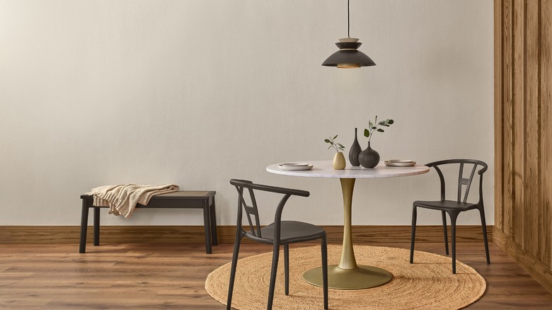
Melodious Ivory from Dutch Boy Paints
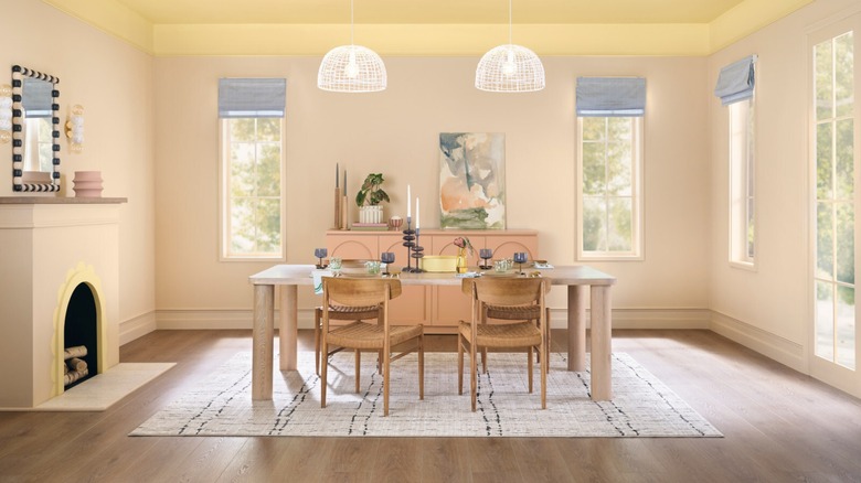
As a creamy, soft beige with warm undertones, Melodious Ivory is a versatile neutral that functions wonderfully as a foundational color. It pairs well with cozy fabrics, handmade crafts, dark-toned wood, travertine (a natural limestone), and veined marble, so it's suitable as the main color on your dining room walls or kitchen cabinets. Additionally, Melodious Ivory is included in three curated color palettes as part of the paint brand's 2026 Color Trend Forecast. These palettes give DIYers a starting place to choose colors that complement this hue without stealing its spotlight.
"Melodious Ivory offers a classic backdrop that beautifully supports the textures, elements and personal touches that make a space truly feel like home," said Dutch Boy Paints color marketing manager Lisbeth Parada in a press release. Parada told Better Homes & Gardens that the company's color forecasting team chose this tone because it represents "nostalgia, calmness, comfort, community, craftsmanship, timelessness, and much more." Keep in mind that if you want Melodious Ivory for your next kitchen revamp, Dutch Boy (a Sherwin-Williams paint brand) is only available at Menards locations, which aren't available everywhere. You can, however, have Menards' online store ship it to you.
Warm Eucalyptus from Valspar
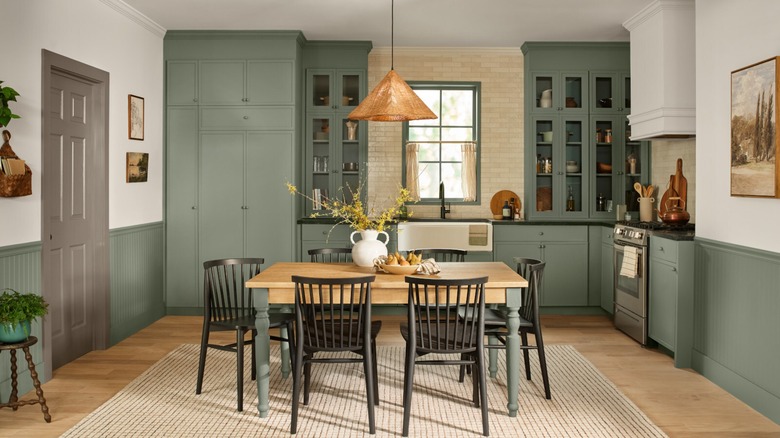
Valspar, another Sherwin-Williams brand, has chosen Warm Eucalyptus as its color of the year for its grounding, restorative nature. This serene, calming shade of green channels vintage palettes and can be used to drench entire spaces with earthy, supporting hues. The brand's experts chose it in response to consumers' desire for comfort and nostalgia. Whether you incorporate it into your kitchen or dining area, Valspar recommends combining it with the company's cozy, brown-gray Groundbreaking paint and its breezy Degas Blue with hints of gray and green. Together, the brand believes these shades create a cohesive, soothing environment.
"Warm Eucalyptus is more than just a beautiful shade of green, it's a reflection of the comfort we crave in our homes," said Valspar director of color marketing Sue Kim in a press release. "Its warm undertones create a grounded, welcoming mood while drawing inspiration from nature and the familiarity of retro design. This is a color that encourages restoration and resilience." To get your hands on Warm Eucalyptus, you'll have to purchase it from a Lowe's Home Improvement location or the retailer's mobile app or website.
Hazelnut Crunch from Clark+Kensington
The Clark+Kensington Hazelnut Crunch color of the year is a deep shade with neutral, earthy tones that add depth and warmth to a kitchen or dining room. The brand's design team collaborated with Colour Hive, its color trend forecasting partner, which chose this color for its nature-rooted tones that make a space feel nurturing and grounded. Hazelnut Crunch is super versatile, as it's available in a semi-gloss specifically formulated for cabinets, doors, and trim, giving your kitchen a toasty, bold presence. It's also the anchor of two 2026 Clark+Kensington Color Trends palettes: the Grounded collection of neutral, warm shades and the Tranquil series of soft, mineral hues.
Hazelnut Crunch is "a beautiful, deep shade that creates the perfect backdrop for relaxed living, pairing effortlessly with both natural textures and modern elements," commented Ace Hardware chief marketing officer Kim Lefko in a press release. Made in the U.S., all Clark+Kensington paints are a primer and premium paint in one product. While they are exclusive to Ace Hardware stores, you can also browse and purchase them through The Paint Studio (the retailer's online platform) if you don't have a store near you.
Special Walnut from Minwax
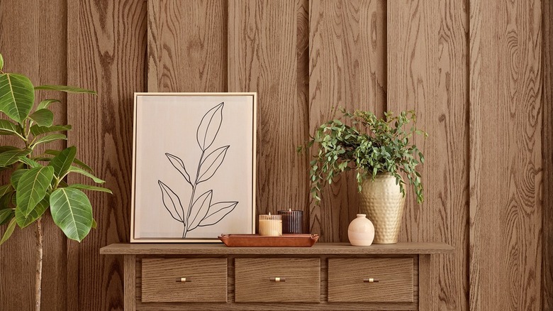
In contrast to the brands that selected a paint color for 2026, Minwax (yet another Sherwin-Williams brand) chose a wood stain for the year. Special Walnut is an earthy, warm brown stain that can add textured personality to cabinets, floors, and other architectural details in your kitchen. The Minwax team chose it for its nostalgic charm, timeless appeal, and ability to anchor natural wood in a design. Available in oil and water-based formulas and in semi-transparent and solid finishes at various retailers, you can use it as an accent or an all-over stain wherever you want your home's natural wood features to shine.
"Special Walnut delivers [on consumer desire to enhance the natural character of wood] with a classic, dimensional tone that feels both familiar and fresh," said Minwax color and design lead Lisbeth Parada in a press release. "Its versatility makes it a favorite across styles and applications — whether you're restoring a vintage piece or finishing a weekend project." It also "offers a rich, layered look that adds visual weight and authenticity, creating contrast and interest in both contemporary spaces and cozy, lived-in homes."
Matte Coffee Bean from Krylon
In the spray-paint department, Krylon (another Sherwin-Williams brand) has revealed Matte Coffee Bean as its color of the year for 2026. The company's team chose this rich color because it creates a sense of connection to nature and wellness that consumers are embracing, though it's still versatile enough to work with many design styles. Matte Coffee Bean blends well with marble, stone, wood, and other organic materials, creating classic and elevated spaces. It's also part of a complementary palette of neutral and warm colors that, together, create a cozy and dynamic aesthetic.
"Matte Coffee Bean adds dimension with a natural, grounded allure, aligning with today's increasing appeal of organic minimalism," noted Krylon color marketing manager Lisbeth Parada in a press release. "Inspired by elements like clay, wood and stone, this hue is a timeless yet sophisticated choice that elevates everyday spaces and invites a sense of harmony and serenity into the home." To elevate elements of your kitchen with this color, look for it in one of your local retailers, like Lowe's Home Improvement, Hobby Lobby, or Walmart. You can also order it from Krylon through Amazon.
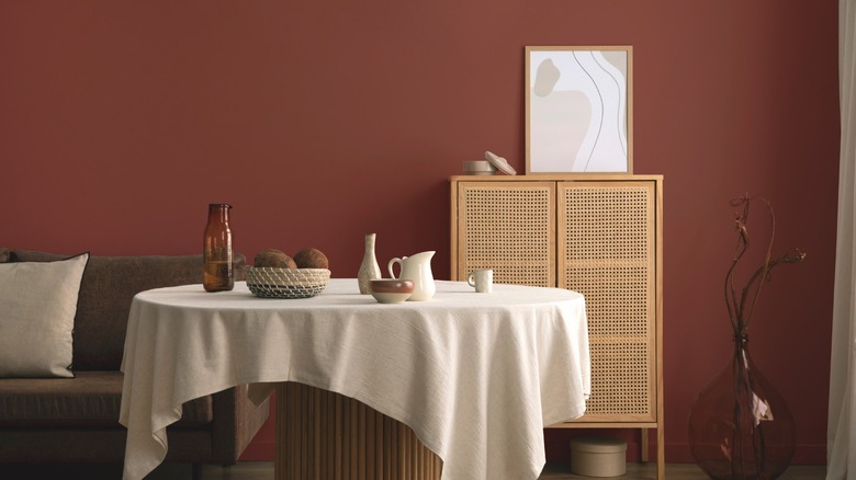
Divine Damson from Graham & Brown
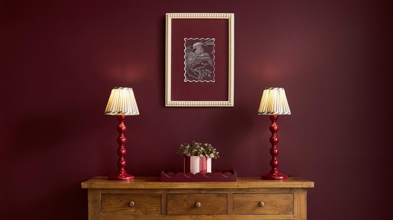
Divine Damson, the chosen color of the year from Graham & Brown, is a deep shade of plum. As such, it's well-suited for the clever cabinet paint trick that gives small kitchens a big look — using lighter colors for the uppers and darker colors for the lowers. The elegant hue also complements a variety of designs with earthy, neutral shades. Part of a larger trend collection, it pairs with Graham & Brown's Eternal Weave design of the year and Eternal City mural of the year. All of these products and more are available for order on the company's website.
When speaking with ELLE Decor about Divine Damson, Graham & Brown senior stylist and trend specialist Paula Taylor commented, "While not directly drawn from the fashion world, jewel tones like this often transcend categories — appearing in interiors, textiles, and fashion alike — which speaks to their timeless and universal appeal." In a separate statement, Taylor said, "Divine Damson brings a dramatic flair to any space, its subtle violet undertone adding a touch of refined elegance. ... The dark cherry red color feels bold and polished, making a strong visual statement" (via Martha Stewart).
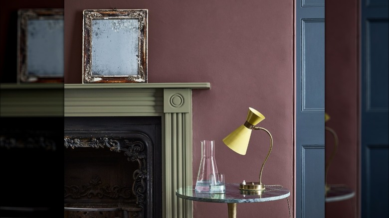
C2 Epernay from C2 Paint
Taking a softer approach to the 2026 color of the year, C2 Paint has announced C2 Epernay as its choice. It embodies a time when artistry, craft, and nature were part of everyday life. With tranquil mineral undertones, this pale yellow is the epitome of grounded and timeless elegance. Named after a French village with limestone architecture and rolling vineyards, it offers opulence and warmth, making it delightfully versatile. C2 Epernay isn't alone, though — it's part of the En Terre collection of soft, earthy hues in shades of brown, cream, and green.
"C2 Epernay has long been tied to European influences and is now emerging in contemporary design for its classic, versatile ambiance," explained C2 Paint color specialist and interior designer Philippa Radon in a press release. "This historic hue helps us retell the wondrous stories woven through history via the inseparable threads of color, art, furnishings, and nature. It reminds us to appreciate the personal touches that make a home uniquely ours — and to live with reverence for the stories we're creating every day."
Adventurer from Little Greene
Produced by the Little Greene Paint Corporation, Adventurer is a rich, royal shade that combines brown and plum tones. The color's matte finish gives spaces a sense of luxurious restfulness and tranquility, and its high-gloss counterpart allows the red undertones to shine through, creating a sense of historical opulence. It's available in other finishes, too, and you can use it either as an accent or an all-over color. While it's one of the best paint colors to pair with white kitchen cabinets, it also pairs well with a wide array of tones, including pale pinks and neutrals.
"Regal, reassuring plum aubergine hues like Adventurer are historically associated with opulence, providing the perfect shades to combine luxury with tranquillity, intimacy, and restfulness in bedrooms, dining rooms, and baths," Little Greene creative director Ruth Mottershead told Galerie magazine. "This sumptuous hue provides a sophisticated alternative to brown for an elevated scheme with a beautiful, charismatic depth of color." This water-based paint is handmade in the U.K. but is available to order through the Little Greene website.