

7 Popular Kitchen Paint Colors From The '70s That Deserve A Revival
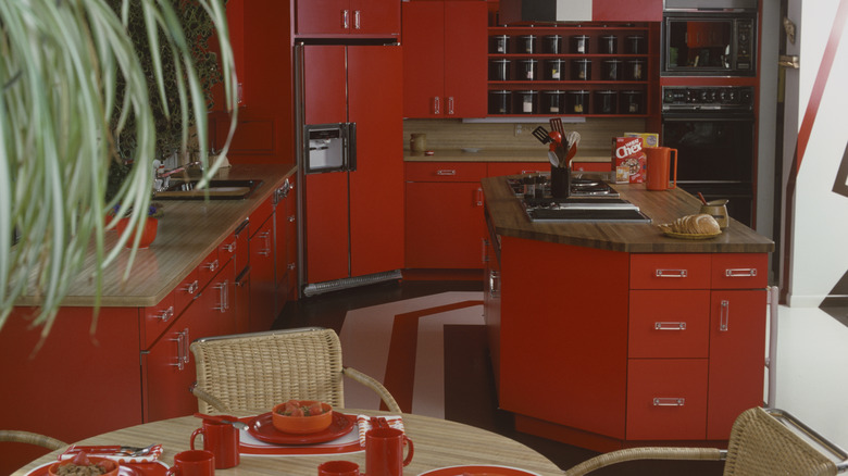
From vibrant shag carpets to sunken living rooms and maximalist accents, the 1970s was an era that made bold statements in the home, especially the kitchen. Beyond whipping up Hamburger Helper and other dishes that defined that disco era, kitchens were a reflection of personality, rebellion, creative expression, and a daring enthusiasm for color that modern interiors can't quite match. And while some are seeing a resurgence in popularity, others haven't quite cycled back into fashion; but they deserve a revival based on the aesthetic and memories they bring with them. Everything from bright greens to cheery reds, rustic oranges and muted earth tones made their way into American kitchens. Appliances in the '70s, along with counters, islands, and cabinets, were often the same shade as whatever was trending at the moment, and sometimes people were mixing and matching décor.
While they may not be what's trending today, these seven retro shades are classics that deserve to be brought back to life in the kitchen. Consider one for your next remodel to bring a little vintage magic and nostalgia to the space.
Avocado Green
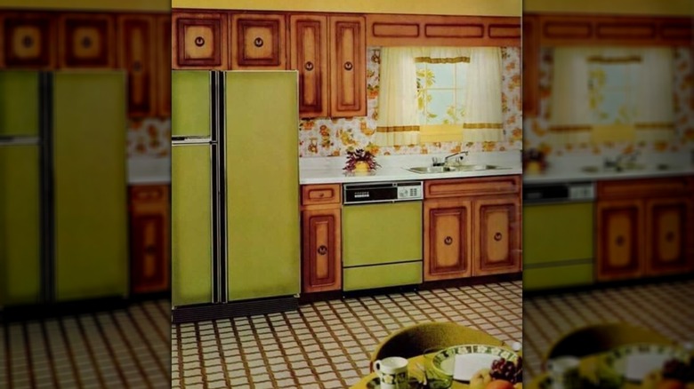
While green was crowned the most popular kitchen color in 2026, this fruit-inspired shade wasn't among the top picks. However, avocado green was all the rage in the '70s. It was one of the most popular colors, with people opting for avocado-green appliances, backsplashes, and wall colors. With the first view of Earth from outer space and the moon landing just a year earlier, households brought Mother Nature's colors into the home. Avocado green also paired with other trending kitchen styles of the time, like knotty pine cabinets, wood paneling, and groovy floral wallpaper.
Harvest Gold
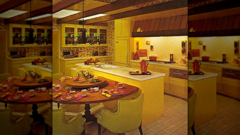
Harvest gold was one of the other top colors of the era. The color wasn't as rich or bold as actual gold but more of a subtle, warm-hued corn yellow. Like avocado green, many '70s kitchens had harvest gold appliances paired with dark wooden cabinets and linoleum or vinyl flooring. General Electric introduced the color in 1968, and other appliance companies followed, with harvest gold as a popular choice well into the '80s. "Pretty much everything was gold," said one commenter on Reddit. "House exterior, living room and [interior] hallways," adding, "and shag carpet to go with the appliances."
Earthy browns
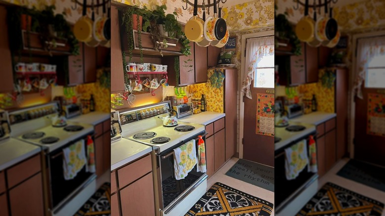
Mother Nature also showed up in a variety of earth tones in '70s kitchens. From butcher blocks to wood paneling and appliances, brown hues dominated every nook and cranny. "The earth-tone rustic nature look was a reaction to the crazy colored Mod look of the sixties and the Mid-Century Sputnik stuff before that," said a user on Reddit. "This was the hippie version of home décor." Dreamy turquoise green and bold butter yellows gave way to grounded, cozy, warm vibes. Of course, consumers still added personal touches with floral wallpapers, bright curtains, and backsplash colors that matched well with the muted browns.
Burnt Orange
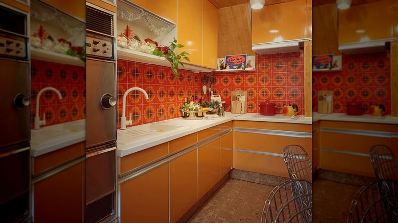
Warm, bold, and pairing well with the earthy brown tones above, burnt orange defined fashion, home décor, cars, and art in the '70s. Kitchens went well beyond the wavy, groovy brown-and-burnt-orange designs most people picture. It was about self-expression and making a statement for those who wanted to buck the era's avocado green and harvest gold trends and show a little more personality. Orange countertops, overhead lighting, and appliances swapped over-the-top '60s psychedelic colors with this muted, autumnal mix of brown, red, and orange. It's a color that still cycles in and out of popularity today, evoking nostalgic memories.
Coppertone
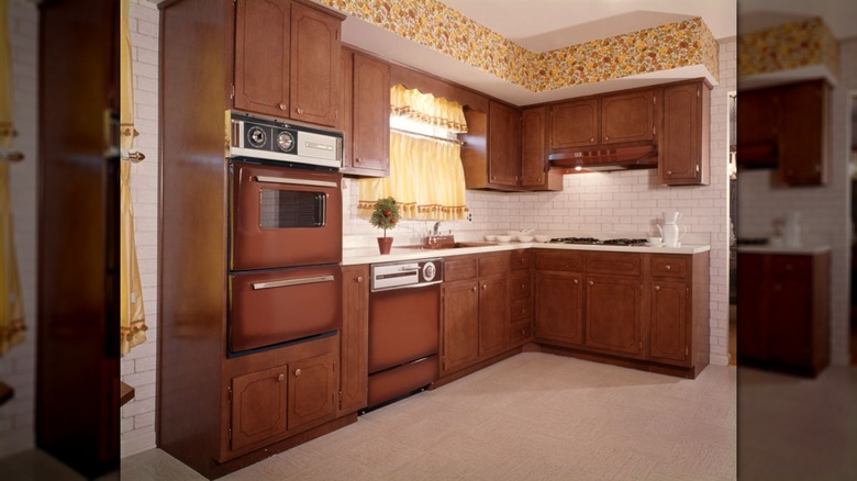
Arguably the third-most popular kitchen color after avocado green and harvest gold, coppertone made a name for itself on ovens, refrigerators, cabinets, and sinks. Also marketed as cocoa or coffee, coppertone fell into the same category as earthy browns and muted Mother Nature colors. "What a great choice it was," said one Reddit user. "The rich brown hid stains and smudges beautifully. It was neutral enough to go with most anything, and had a [warm] and homey feel."
Poppy Red
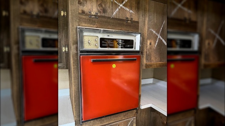
Poppy red added a much-welcomed splash of color to '70s kitchens. Bold, fun, and more daring than the earth tones, the orangey-red hue made its mark on appliances, islands, cabinets, and counters. While it was somewhat trendy and introduced around the same time, it didn't quite "pop" the way avocado green and harvest gold did, so you rarely see it these days.
Almond
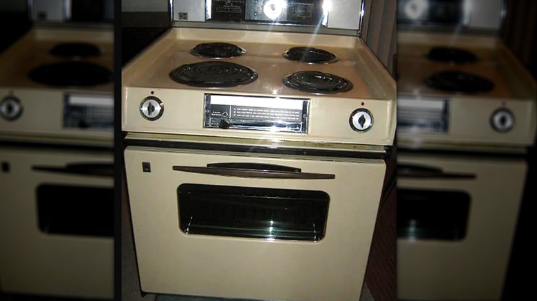
Rounding out the list, the neutral, soft almond tones were popular in the late '70s and well into the '80s. Soft white, beiges, and toasty almond colors that paired nicely with oak cabinets and darker woods became all the rage. Countertop companies like VT Industries cashed in on the trend, with the manufacturer releasing almond countertops "to coordinate with your new almond appliances." Almond was also one of the most popular color choices for a KitchenAid stand mixer in 1977.