

9 Cozy Kitchen Paint Colors That Are Made For Fall
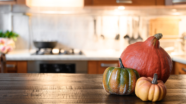
There's nothing like a fresh coat of paint to revitalize a room, and what better time than the coming change in seasons to switch up the kitchen as well? Whether it's a wall-to-wall job or simply an accent wall, there are a number of cozy colors perfect for the coming autumn that can also work year-round.
Several of the colors mirror those of the changing leaves. Bold reds, mellow yellows, and deep oranges are all inviting choices with plenty of specific hues to pick from. The warmth of these colors sets a welcoming scene and will instantly make the room feel more autumnal.
There's no need to limit one's self to just the colors of changing leaves, though. Earthy tones work well in general for cozy fall vibes. The somewhat deeper hues of green, blue, and even purple subtly remind one of nature and ooze magazine cover elegance. Although they get a lot of criticism on their own, warm grays and pinkish beiges also have their place in a cozy fall kitchen, either as accents or main colors.
Forest green
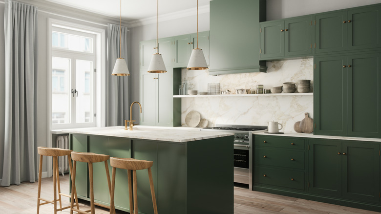
Darker greens mirror the natural foliage of pine trees, ivy, and leaves awaiting their seasonal color changes. It makes for an excellent cabinetry choice paired with silver hardware or, for a more sophisticated appearance, brass or gold.
An entire kitchen in floor-to-ceiling forest green can be a bit much though. For the best fall vibes, consider pairing it with warm neutrals like white marble, brown-colored wood, and perhaps smaller pops of color like orange and red.
Navy blue
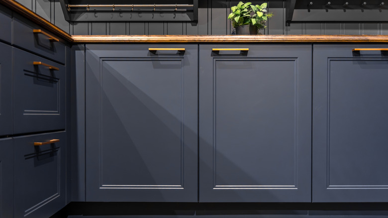
Navy blue can add a luxurious touch to any kitchen in any season. For the autumnal season it shines best with reds, yellows, and especially oranges. But beware of overdoing it. Unless you have a massive kitchen with abundant natural lighting, painting cabinets navy blue can be a design disaster.
Covering such a large part of the room in such a dark color will make it feel smaller, and many home kitchens do not have the room to spare. However, navy blue can still make for an excellent backsplash or other accent color.
Deep red
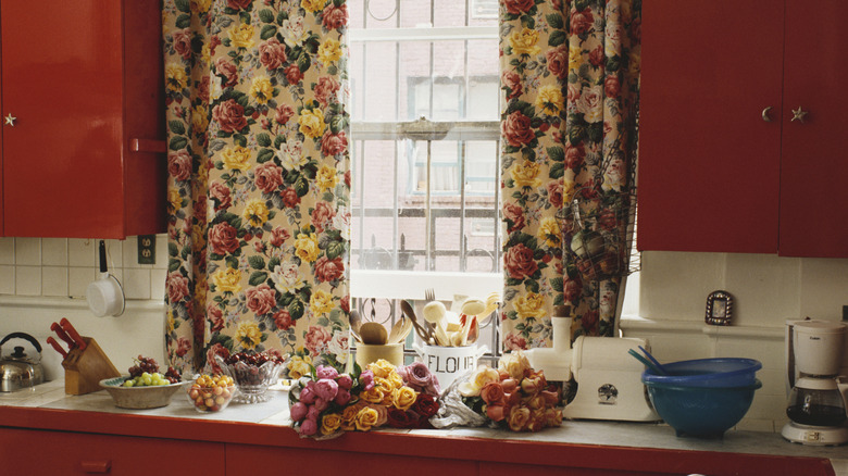
Red is always a striking color for a room. There's a reason that most fast food restaurants use red. People tend to notice the color and find it stimulating on some level. Bringing it into your kitchen works the same human impulse.
Choose deeper reds for a sense of autumn, such as burgundy, crimson, and maroon, which will work best in most kitchens as an accent color of some sort. This should also avoid having your kitchen look too much like a fast food dining room, as such businesses usually choose brighter reds.
Burnt orange
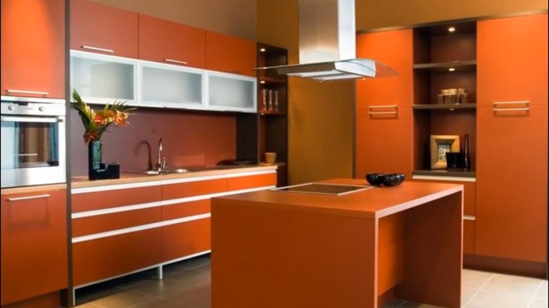
From pumpkins to changing leaves, orange is perhaps the most obvious fall color on this entire list. But rather than a burst of bright, citrusy orange, like a summer harvest, a more subdued color like burnt orange or roasted pumpkin better suggests this changing of the seasons.
Orange is versatile enough that it can be an accent color for statement walls or decor, or you can go all the way and do nearly the entire kitchen in burnt orange. This color also tends to have a retro vibe, so if you have any 1970s-style kitchen appliances or accessories, they would especially shine with this shade.
Medium brown
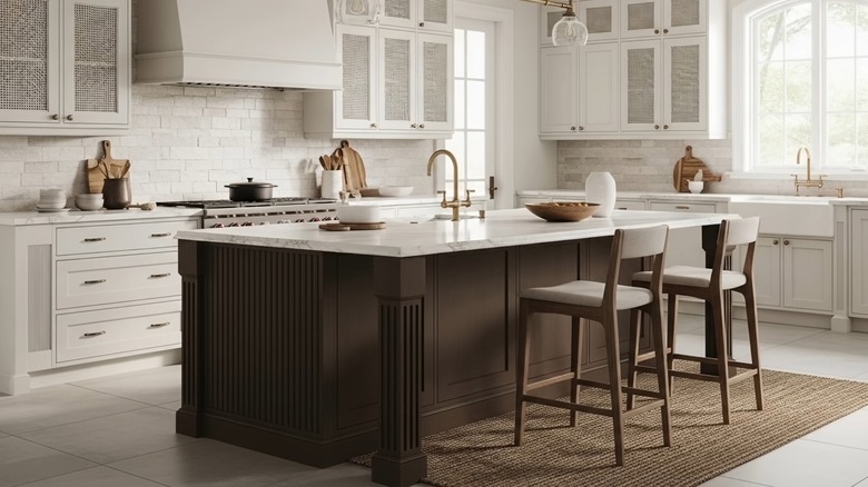
A rich medium brown can anchor the color journey of your kitchen just like thick brown roots anchor an entire tree. Although this is perhaps most commonly seen in wooden cabinets, countertops, or furniture, brown paint can accomplish the same goals — arguably better so, especially for modernist kitchens where visible wood grain can feel too vintage.
Veer toward lighter medium browns for smaller kitchens, or darker ones for larger rooms with the apparent space to spare. In either case, medium brown can work well as an elegant accent to other colors on this list.
Plum
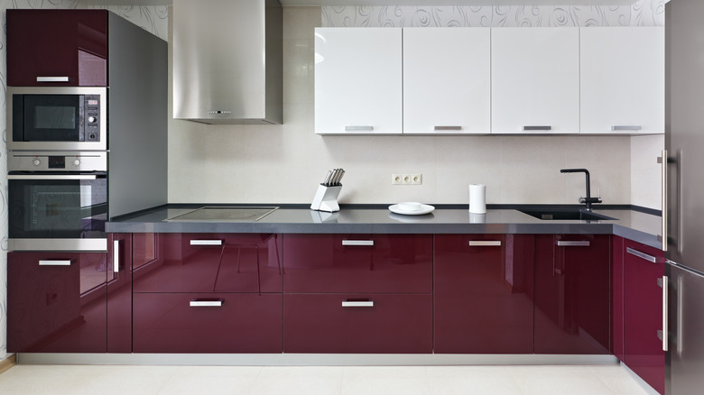
Purples can be a funky and eccentric choice for any room in the home, but plum-like hues closer to the color of some wines and produce can be a sophisticated pick for a kitchen. A large amount of plum is a bold color choice that may or may not pay off, but an accent wall or other painted splashes of it are more versatile avenues. Put plum in a kitchen with deep reds, medium browns, or neutrals like gray or white.
Mustard yellow
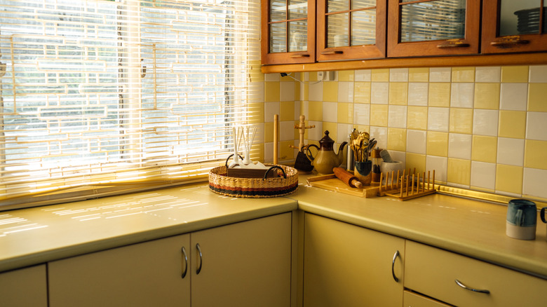
Mustard yellow is another color with both vintage vibes and a close autumnal association. As the third of the main leaf-changing colors, deep, rich yellows like this unmistakably evoke the season. But to avoid your fall kitchen tipping into a retro '70s kitchen (unless you want to lean into that vibe), this color may go best with more modern designs, and/or in splashes of color through the room, such as painted cabinet panels or backsplashes.
Gray
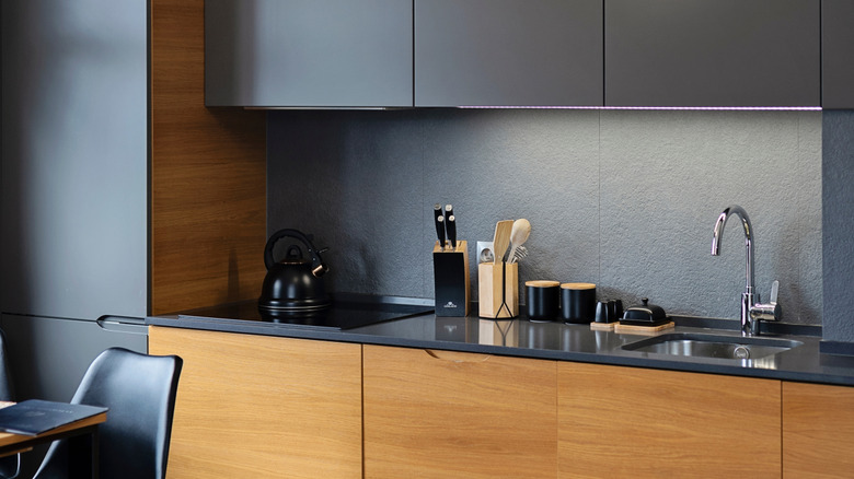
Gray as a home color choice gets a lot of negative attention for feeling soulless, which it absolutely can in abundance. But it remains a viable neutral tone that, when used appropriately, can make a room feel more sophisticated. Grays have a place in the kitchen, particularly opposite more striking colors like mustard yellow or deep red. Don't be afraid to mix the palette up.
Pinkish beige
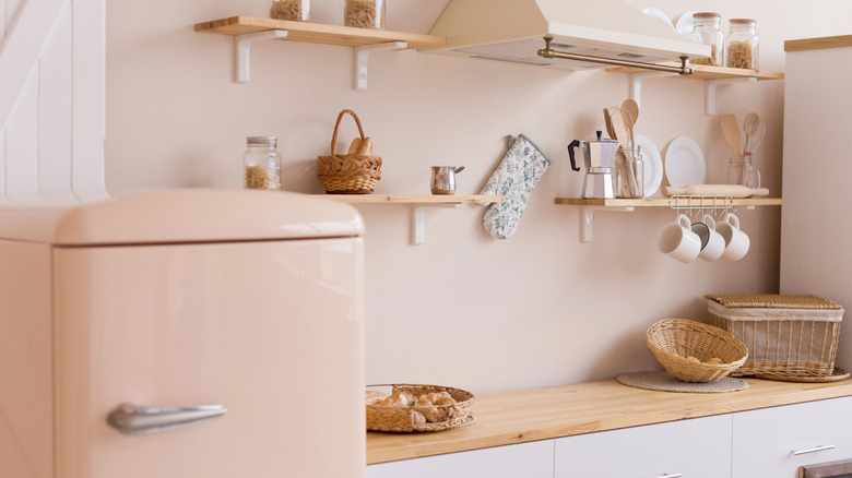
Beige is another well-worn neutral with its fair share of detractors, but there is a reason it sticks around. Adding a touch of pink to the usual eggshellish hues elevates the color and makes it an eye-pleasing match with any other shade on this list. This is especially true for smaller kitchens, which could use the boost in apparent size from brighter colors.
Given the benefits and versatility, it's little surprise that one of 2026's trendiest kitchen paint colors — Melodious Ivory from Dutch Boy Paints — could be said to be a pinkish beige. Whether it's that specific color or not, give pinkish beige a chance.