

6 Kitchen Paint Colors That Pair Best With Warm Wood
We may receive a commission on purchases made from links.
Warm wood tones are experiencing a resurgence in popularity, especially with the rise of nostalgia-inspired designs and a return to all things warm and cozy. If you want your kitchen to feel like the heart of the home, color and warm woods are a huge step toward that. But how do you find a paint color that complements your honey oak cabinets without making them feel dated? You simply need to utilize a little color theory. There are plenty of paint colors that can make your warm wood cabinets feel elevated and not like an eyesore, and we've compiled several here.
Just remember these simple rules: contrasting colors are complementary, and the color wheel is your friend. While there are many options for wall paint colors that you can pair with white kitchen cabinets, warm-toned wood cabinets can make color choice more difficult. If you go with a yellow or orange paint, you risk monochromatic overload that will highlight the yellows or oranges in the wood — this is a sure way to make a room feel dated. Some people resort to painting their cabinets instead of dealing with the honey hues of vintage oak, but this can be a design disaster. If you instead use the colors from our list, you might find you won't have to resort to such drastic measures.
Soft sage green
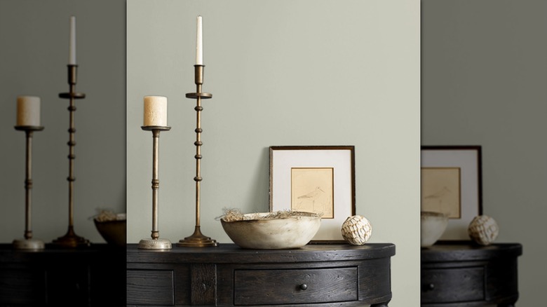
Soft sage green is a lovely color choice, especially if you want to have that country cottage feel in your kitchen. Because green is opposite red on the color wheel, it will naturally complement wood with reddish/orange tones. The softness of a cooler shade like "Soft sage" from Sherwin-Williams is the perfect color choice to bring out the organic wood grain in your cabinets, without exaggerating the warm tones.
Deep olive green
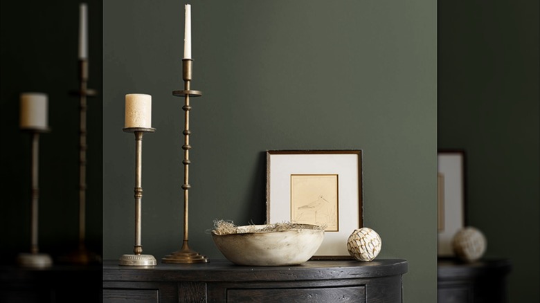
If you're looking for something a little more dramatic, an olive green like Benjamin Moore's "Dark Olive" is a great choice. As with the previous green, this color will help to neutralize the warm tones in your cabinetry but will also add some drama. You won't have to use any paint tricks to elevate your old kitchen cabinets; you just need olive paint. While the sage feels like a mossy creekside, olive feels like a forest fantasy.
Warm white/cream white
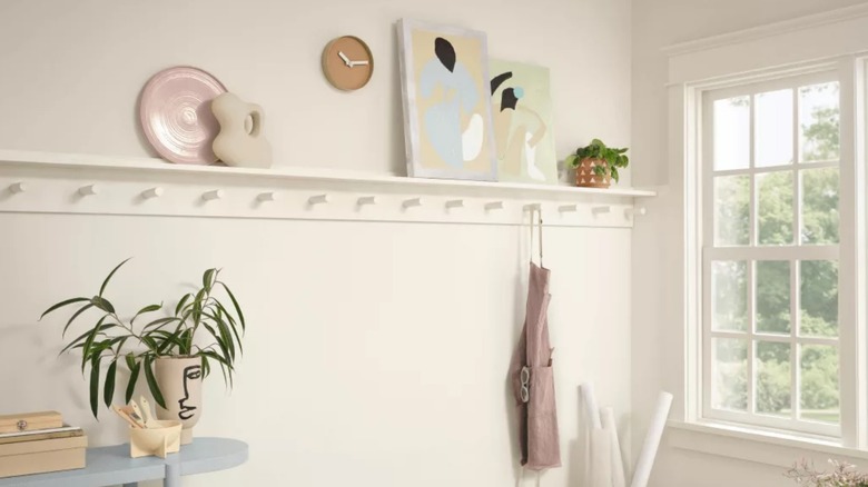
Not only does bright white create too much of a contrast with wood cabinets, but it also isn't a good idea for the kitchen due to it showing every possible stain and splatter. Warm white/cream works well with natural warm wood as it acts like a canvas, allowing the wood cabinets to take center stage. It's a great choice if you want a touch of subtle warmth and a neutral palette. Alabaster by Sherwin-Williams is the perfect example of this type of white.
Navy/dark blue
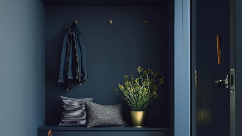
Another perfect color for those who like a little drama in their kitchen is navy or a dark blue. Because blue is on the opposite side of the color wheel from warm red, orange, and yellow, it is a perfect complementary choice. This pairing creates the wonderful visual temperature balance with the cool of the dark blue and the warm tones of the wood. Navy is also a very timeless color that can add a touch of elegance to your kitchen. Some great examples of colors you could choose are "Naval" by Sherwin-Williams or "Hale Navy" by Benjamin Moore.
Taupe
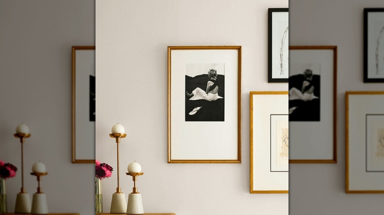
"Modern Gray" by Sherwin-Williams may have gray in the name, but it is a shade of taupe that works well with warm woods. It has warm undertones, but only enough to create a harmony with warm-toned wood cabinets, very much the opposite of a high-contrast color like navy. It has a similar effect as the warm white/cream paint shade suggested on this list. A soft taupe paint provides a seamless transition from wall to cabinet for those who like a calming kitchen atmosphere.
Deep brown/charcoal
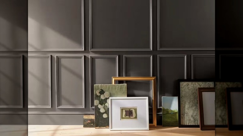
Benjamin Moore's "Silhouette" is the perfect example of an espresso/charcoal color that works well with warm-toned wood kitchen cabinets. This color blends a few hues that work with warm-toned wood: charcoal gray, dark brown, and a very small touch of purple. It's another color choice with the right amount of drama but still comes off as elegant. It works well in the kitchen for the same reason a navy does: a strong contrast that comes across as moody, high-end, but not overwhelming.