6 Vintage Chain Restaurant Logos We Wish Would Come Back
While many restaurant chains market themselves by touting the quality, quantity, or affordability of the menu items they have to offer, they also do so by having emblematic and unforgettable logos that stick in the brains of consumers who encounter them. There are many current chain restaurant logos that don't need updating, but there are some that simply don't live up to their predecessors.
Whether it's because the newer logos are too minimalist — like the panned Cracker Barrel logo that was scrapped soon after it was announced — or are simply not nice to look at, there are several instances where companies should've never changed their iconic logos and stuck to what was working once upon a time. These logo switches could've been as major as a complete change in color scheme and iconography or as simple as a color swap that doesn't sit right, but the yearning to return to the old logos in question persists all the same.
Starbucks - 1987 version
While Starbucks began as a coffee production company rather than a coffee shop, 1987 saw new management inspired by Italian cafés take over and revolutionize American coffee culture as we know it. With that new direction came an updated version of the Starbucks siren, the image that each iteration of the logo has been based on ever since. However, it's hard to argue that the first version of the beloved Starbucks logo doesn't have certain qualities that make it stand out from the newest variation. The zoomed-out look at the siren in all her glory gives consumers a more detailed artwork, and the use of black and white alongside Starbucks' signature green tone makes the logo pop much more than the simple green and white version you see today.
Wendy's - 1982 version
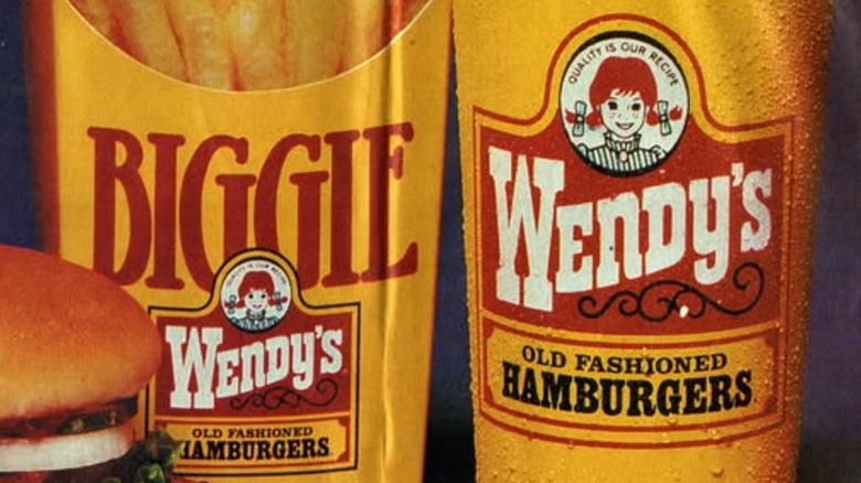
The Wendy's logo has featured the icon of Wendy herself — a girl with red hair and pigtails in a blue and white dress based on founder Dave Thomas' real-life daughter — since the chain's inception, but once upon a time, the logo was much more than just the beloved chain's mascot. The 1982 version of the logo — which stuck around all the way until 2013 — featured Wendy atop a red board of information, including the name of the chain in white and its tagline, "Old Fashioned Hamburgers," in black with a yellow background behind it. While this logo has sometimes been said to have too much going on within it, the addition of the yellow and black tagline gave the design much more of an identity and helped it stand out from other chains.
Dunkin' Donuts - 2007 version
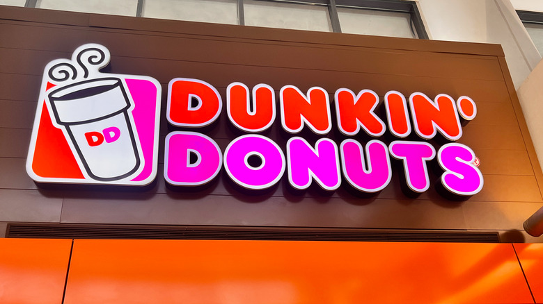
Despite being less than 20 years old, the 2007 Dunkin' Donuts logo is by far the most nostalgic and missed logo in the chain's history, and for one small yet integral reason: The cup of coffee. Dunkin' Donuts rebranded to Dunkin' in 2019, which was considered a very controversial rebrand at the time. It also made the decision to simplify its logo to reflect this change, taking away the iconic cup of coffee with steam coming out of it. This felt like a major misstep for the brand, as the motif was easily recognizable and synonymous with the chain throughout the 2000s. Since the 2007 logo can still be found at a few Dunkin' locations across the globe, the return of the cup of joe isn't outside the realm of possibility and would be a return to form for the chain in terms of unique and interesting design.
Taco Bell - 1992 version
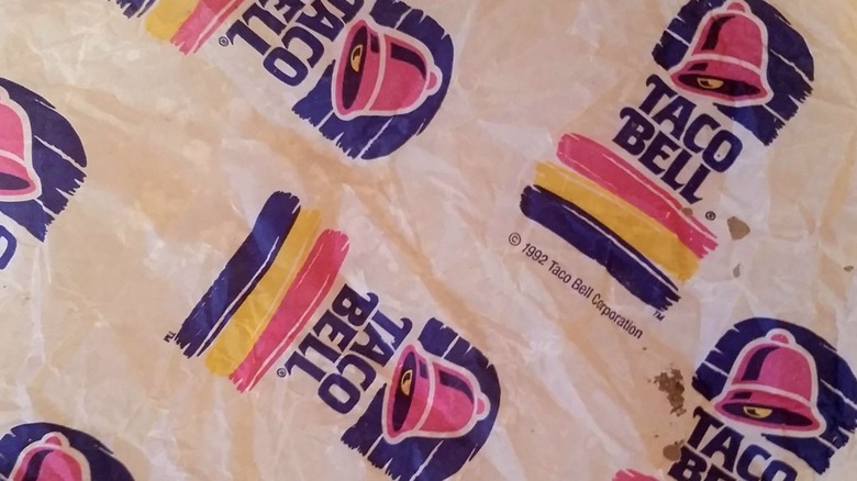
Taco Bell's various logo changes have led many to feel a profound sense of nostalgia for one era of the chain or another. However, while the chain's 1992 design only lasted for two years, it had details that are lacking in later designs. It is slightly more gritty and detailed than the similar version that would replace it in 1994, and much more colorful and vibrant than the current logo that came with the wave of minimalism in the 2010s. The 1992 logo stands out as perhaps the best of several great logos in Taco Bell history. As the second to use the chain's signature bell iconography and the first to use the pink and purple color scheme, this short-lived logo had a generally eye-catching design that made it stand out.
Subway - 2002 version
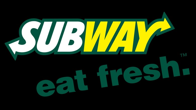
After changing its logo sporadically for its first three decades of operation, Subway landed on what felt like its definitive design in 2002, using white and yellow text with a dark green outline to help the chain's name pop. This simple yet effective design was used by the company for 15 years before it was updated in 2016, in what could best be described as a simple change that ultimately led to a generally weaker logo. The design overhaul saw Subway shift away from its white, yellow, and dark green color scheme in favor of bright yellow and bright green text with no outline, a move that felt like a major step backwards for America's largest food chain. With no third color to accent the newer, brighter logo currently in use, it feels somewhat incomplete compared to the longstanding former design.
Burger King - 1999 version
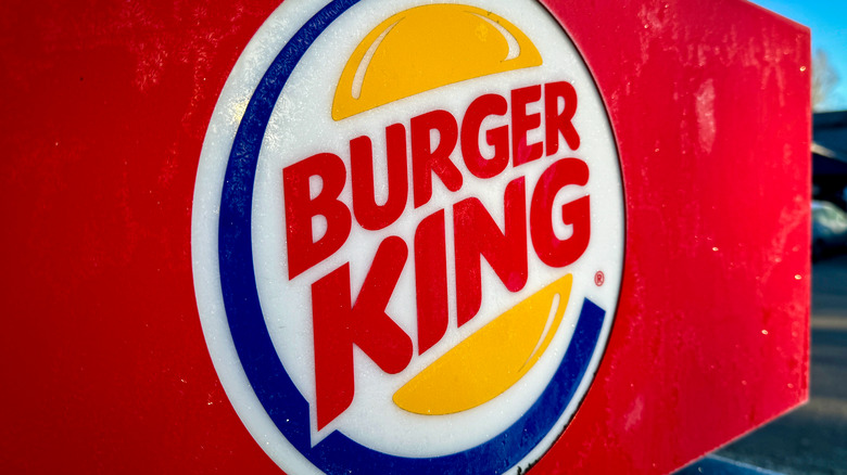
A rare instance where a chain actually did revert back to a retro logo after a long time away is Burger King, which essentially reintroduced its logo from throughout the late 20th century in 2021. However, for those who have a great nostalgia for the 2000s in particular, there's no doubt that the 1999 version is the one they wish remained intact. Utilizing the recurring motif of placing the words "Burger King" between two buns, the 1999 logo did so while also having the words slanted at an angle and adding a large blue border around it to frame the words and logo quite nicely. This design utilizes three distinct colors — blue, red, and gold — incredibly well to make the logo recognizable and eye-catching, two of the most important qualities a fast food logo can possibly have.