

How Hershey's Candy Bar Wrapper Has Changed Over The Years
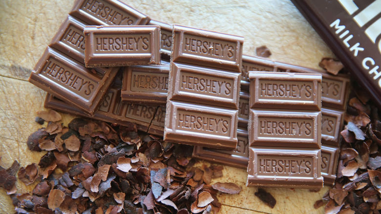
It may seem like the iconic Hershey's candy bar wrapper hasn't changed in decades, but there have been numerous slight alterations — and bigger changes — since its debut in the year 1900. But on top of that, according to The Hershey Community Archives, there have been "nine main design iterations of Hershey's Milk Chocolate bar wrapper."
As with any consumer product's container design, the Hershey wrapper has changed according to industry trends, packaging materials, and more. Once upon a time, Hershey wrappers featured company slogans, or even advertisements for other Hershey products. Other changes through the eras include different fonts, gilded lettering, and colors — the famous maroon-brown wrapper wasn't always brown.
In all, the wrapper has seen nine distinct design eras, within which there have been many smaller changes. Due to archival challenges in matching the different ways Hershey's tracked assorted wrapper designs and chocolate molds through the generations, the Hershey Community Archives admits "there are gaps and overlaps" in the historical record of what this bar looked like. But before the dozens of Hershey wrappers that existed, there was first an almost unrecognizable one.
The white wrapper (ca. 1900-1903)
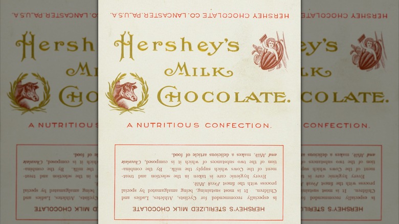
The very first Hershey's bar came wrapped not in maroon, but in glossy white paper with embossed golden lettering. Milk chocolate was then a relatively new invention that hadn't quite made it to the United States, and founder Milton Hershey took advantage of consumer unfamiliarity to introduce the "nutritious confection" as a healthy food.
"Hershey's sterilized milk chocolate" was "especially recommended for Cyclists, Athletes, Ladies, and Children." Neither the athletic angle nor the white wrapper lasted long.
Gold-on-maroon (ca. 1902-1906)
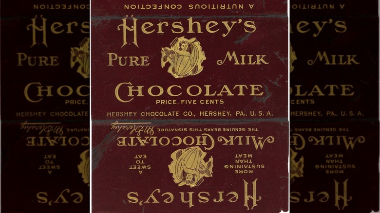
Hershey's first packaging quickly gave way to its second design era, which debuted its now-iconic maroon-brown color. The bar, newly renamed "Hershey's Pure Milk Chocolate," added Milton Hershey's signature as an authenticity mark. It also featured an unusual slogan – "more sustaining than meat" — that tried to present chocolate as an energy booster. And another first for this version: a manufacturer's suggested retail price (MSRP) of five cents.
Silver-on-maroon (ca. 1906-1911)
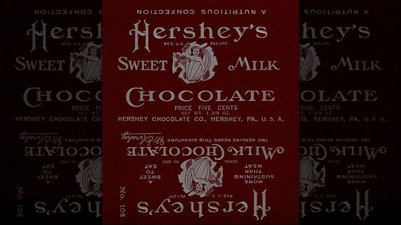
In 1906, the wrapper switched from gold to silver lettering because of a copyright complaint from a rival candy company with a similar color scheme. Around this time, Hershey's also changed the paper wrapping to a sleeve that held a brand-new inner foil wrapping, another early design change that would become iconic.
Big block letters (ca. 1913-1915)
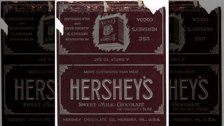
This redesign described Hershey's as "sweet milk chocolate", below the first iteration of the company's now-famous block-lettered logo. The new wrapper also added a silvery border with cocoa bean clusters in each corner, a statement of the candy's 1 3/8 ounce net weight, and advertisements for Hershey's Breakfast Cocoa and Almond Bars on the back — a forerunner of the many almond varieties among the best Hershey's bars today.
Big block letters, still five cents (ca. 1915-1920)
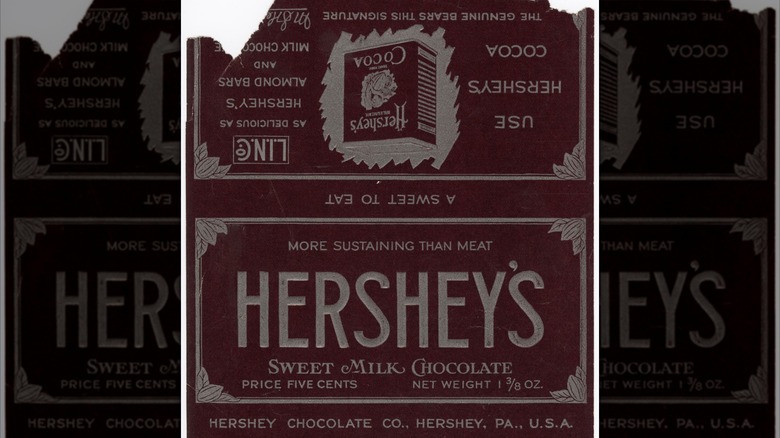
Labels printed under the previous redesign omitted the price for unknown reasons, but it was added back around 1915, in the bottom left next to the candy's net weight. Another subtle change was a second, thinner border on the inside of the existing one.
Corporate chocolate (ca. 1928-1939)
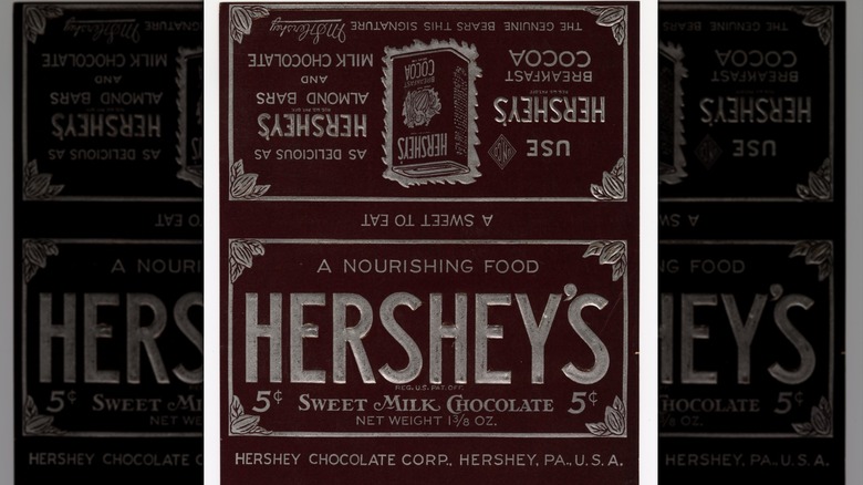
Hershey's 4th design era saw bigger block lettering, the removal of the second border, and the addition of a "5¢" price (as opposed to spelling it out) in the corners, almost like paper currency. This wrapper also added the tagline "a nourishing food," a small patent reference, and the name of the newly reorganized Hershey Chocolate Corporation.
Small tweaks and fluctuating weights (ca. 1932-1936)
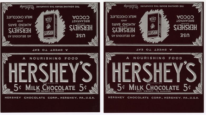
Hershey bar packaging was not always consistent, as evidenced by these 1930s variants. The size of the chocolate bar fluctuated during this decade, and the label changed to reflect new weights of 1 3/4 ounce or 1 7/8 ounce. But the inner silver border also made a comeback, and the wrapper dropped "sweet" from its "milk chocolate" descriptor, which was now in a blockier font similar to the logo.
Fuller letters and vanillin flavor (ca. 1940)
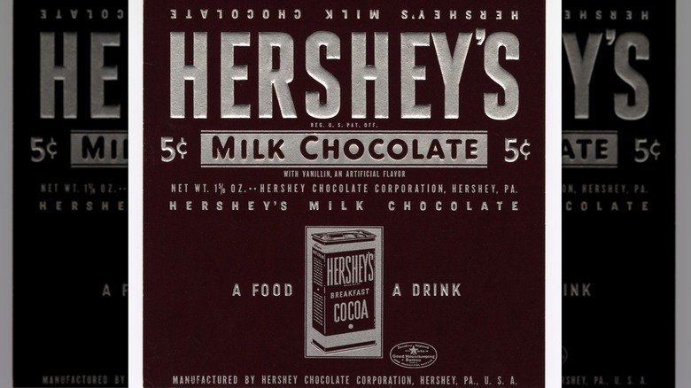
In its 5th design era, the wrapper dropped the Art Nouveau-ish cocoa detailing around the sides in favor of bigger block lettering, closer to its modern appearance. The "milk chocolate" descriptor got a rounded and color-inverted redesign; the back now had a simpler cocoa advertisement and a stamp of approval from Good Housekeeping. Discerning eyes may also note a small acknowledgement of vanillin, a melt-resistant artificial flavor the company included around this time and used until 2015.
Twilight of the foil wrapper (ca. 1943)
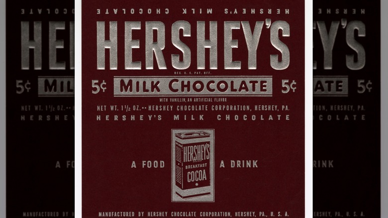
This version of the wrapper looked virtually identical to the 1940 design, aside from a reduction in weight from 1 5/8 ounce to 1 1/2 ounce. But beginning in 1942, the chocolate itself was no longer wrapped in silvery foil, but glassine paper instead. The plasticky paper was resistant to air, water, and grease intrusion, and would be a Hershey's bar standard until the mid-1980s.
One era begins, another one ends (ca. 1950)
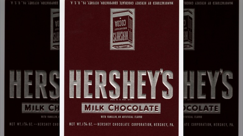
Hershey bars' 6th design era saw more slight changes: text removal on the cocoa advertisement, the elimination of the "5¢" label (though it remained the MSRP), and an overall simplification that moved the increased weight and corporate info to the bar's sides. It was also the last Hershey bar wrapper to feature embossed text.
The first flat Hershey wrapper (ca. 1951)
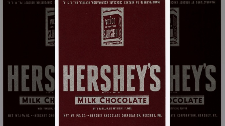
1951 saw the debut of Hershey bars' first non-embossed wrapper, which, aside from that major change, was the same design as the year before. But this was also the last gasp of another longstanding Hershey's trend: advertising Hershey's Cocoa on the back, which by this point was just a simple image of the can.
First in favor and flavor (ca. 1952-1968)
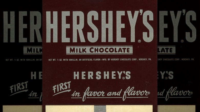
Although this slogan first debuted in 1941, it wasn't added to the Hershey wrapper until 1952, when it finally replaced the old-fashioned cocoa advertisements. This 1-ounce bar's tagline was stylized silver text and cursive on a maroon background, with a secondary Hershey's logo above it. The vanillin disclosure also moved to a more subtle location.
Tweaks on favor and flavor (ca. 1958)
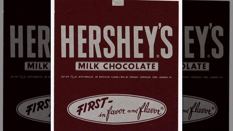
This highly similar redesign appeared around 1958, with the same slogan instead in maroon text on a silvery-colored oval, sans the extra Hershey logo. This version also squared off the lettering on "Milk Chocolate," and made the letters the same height, and returned to the traditional 1 3/8 ounce weight.
Price labels return, with an increase (ca. 1968)
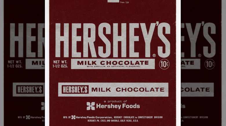
The 7th design era began in 1968, eliminating the double border around "Milk Chocolate," now paired again with the vanillin disclosure. A new logo on the back labeled it "a product of Hershey Foods" for the first time, replacing the old slogan. But the biggest change was Hershey's first-ever price increase for the standard bar, which had previously changed sizes to stay at 5 cents. The new MSRP of 10 cents was added to the bottom right of the label's front.
A shrinking 10 cent bar (ca. 1968-1969)
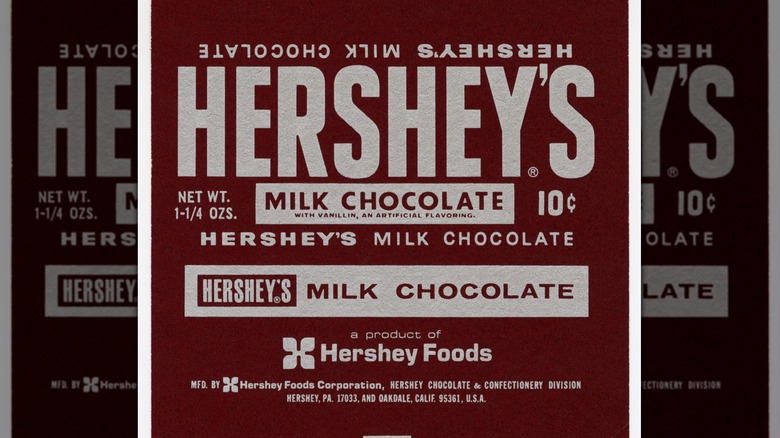
The size of the bar changed again soon after the price increase, going from 1 1/2 ounces to 1 1/4 ounces. This wrapper also brought back text on the side reading "Hershey's Milk Chocolate," a first since the 1940s.
It was also in 1969 that Hershey's chocolate went to the moon, though Neil Armstrong and the other Apollo 11 astronauts didn't bring the 10-cent retail bar into space. Instead, it was a Hershey Tropical Bar, a heat-resistant military ration Hershey first developed for World War II.
Hershey's first nutrition facts (ca. 1973-1976)
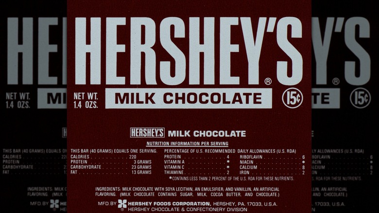
The Hershey bar wrapper's 8th design era began with a major change: the introduction of nutrition facts on the paper sleeve. This included a brief ingredients list to which the vanillin disclosure moved. Other changes were the removal of text along the side, a 5-cent price increase, and switching the net weight from fractions to decimals — a practice that continues today.
Hershey's first barcode (ca. 1976)
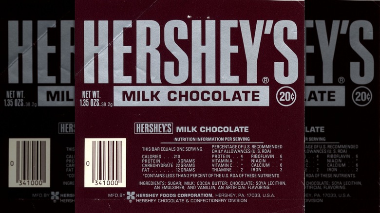
Along with another 5-cent price hike for a slightly smaller (.05 ounce) bar, this 1976 redesign featured the standard Hershey bar's first UPC barcode. To make room for it on the back, the nutrition facts panel also received a slight redesign and rewording.
A third nutrition panel design (ca. 1978-1982)
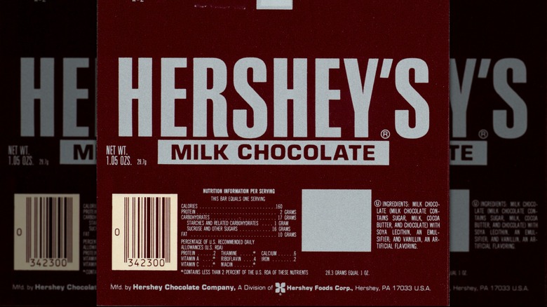
After yet another price increase in 1978, instead of changing the 20-cent MSRP, Hershey simply removed it from the wrapper. This was the chocolate bar's plainest front design yet, although the nutrition panel received yet another redesign. Nutrition information and ingredients were now separated by a plain silver square, likely related to the wrapper's manufacturing.
Off-center chocolate (ca. 1985-1996)
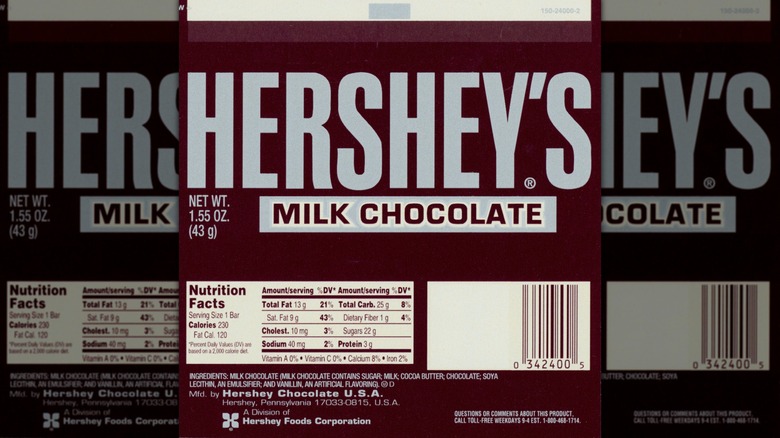
The Hershey bar's 9th and current design era began around 1985, with the return of a silver foil wrapper inside the maroon paper sleeve. The sleeve itself received minor alterations, with the "Milk Chocolate" descriptor moving off-center to the right. There was also a major change to the chocolate itself: a final weight of 1.55 ounces, with future adjustments coming to price instead of weight.
The modern wrapper takes form (ca. 2003-2010)
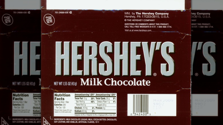
This 2003 redesign ditched the inner foil wrapper for good, with the maroon wrapper instead sealing the entire bar. The Hershey's logo received a faux-embossed facelift, and "Milk Chocolate" was now in white, regular-case letters.
Optical illusionary labeling (2010)
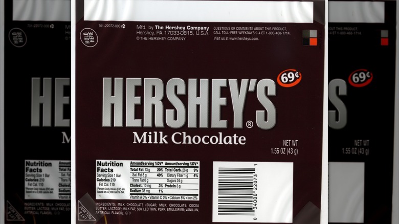
This version of the wrapper had some of the subtlest changes yet. The bar's weight moved to the right side, and the Hershey logo swapped its embossed visual effect for a faux sheen, an optical illusion created by using slightly different grays in the logo. (It's unknown why this example is labeled with a price of 69 cents, since prices on labels ceased by 1996 and Hershey bars were closer to $1 in 2010.)
An all-caps wrapper (2010-2013)
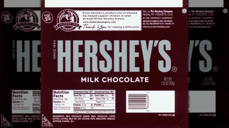
The milk chocolate descriptor became all capital letters in 2010, like the logo and new "since 1894" text along its side. The back also got an acknowledgement of the Milton Hershey School, a tuition-free private boarding school for low-income students that's deeply intertwined to the chocolate company by their shared founder, Milton Hershey.
Formally gluten-free (2014-2017)
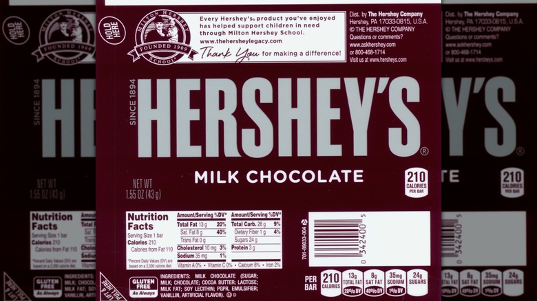
Chocolate is among the junk foods people don't know are gluten-free, which may be why Hershey's added an acknowledgement of this next to the ingredients panel in 2014. Another first added during this redesign was a calorie count — 210 calories per bar — added to the bottom right front of the wrapper.
Today's Hershey bar wrapper (2017-current)
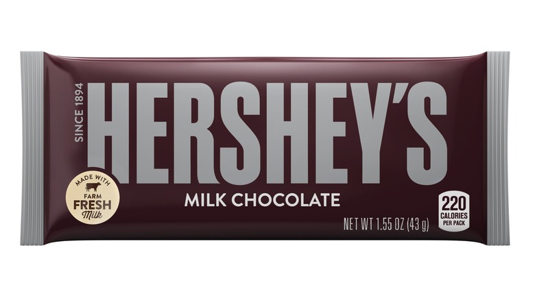
The sleekest bar design yet, this minimal wrapping harkens back to earlier design eras with the gray-tipped fringes on the plastic. These are an homage to the silvery foil inner wrapper, which became iconic to generations of consumers. And if there were any doubt that, after over a century, it's still real milk chocolate, a label in the bottom left now advertises the use of farm-fresh milk.