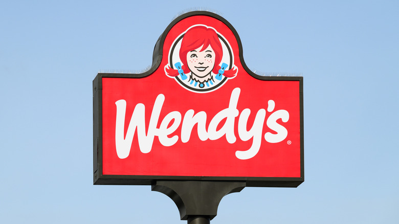
1960s To Now: Wendy From Wendy's First Logo Looks Different Than She Does Today
Wendy's is one of the bigger players in the American fast food landscape, notable for its square burgers, signature Frosty desserts, and distinctive logo. The little girl in pigtails has been with Wendy's since the beginning, and her look has changed a bit through the years. But so too has the actual Wendy, founder Dave Thomas' real daughter and namesake of the restaurant.
Melinda Lou Thomas's young siblings often mispronounced her first name as "Wenda," leading to the nickname Wendy. And when Dave Thomas was starting his burger restaurant, he knew he needed a mascot, similar to KFC's use of Colonel Sanders — which was also Thomas' idea, as Sanders' franchisee and protege.
With her blue and white dress, bright red hair, and pipe cleaners as hidden bracing to keep her pigtails perky, 8-year-old Melinda Thomas grinned through a photoshoot that would birth the Wendy's logo. And although Dave Thomas regretted the name Wendy's for the pressure it put on his daughter, it did create an iconic and globally recognized corporate logo.
Wendy in 1969
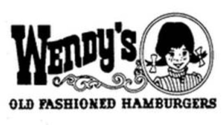
The original Wendy's logo debuted in 1969, establishing the girl's hair with pigtails and a blouse, pictured within a cameo. This basic design, with subtle changes, has carried through all the way to today.
The 1970 update
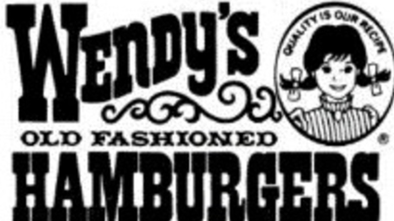
Her image was refined a bit in 1970 with the addition of "quality is our recipe" around the top of her cameo. One of the things you may not know about Wendy's is that this slogan is the original one, even though it wasn't in the logo until a couple of years later.
The change in 1981
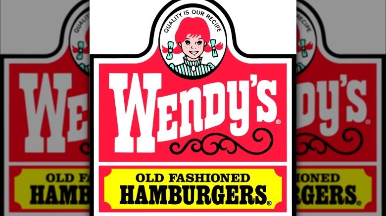
The monument logo came out in 1981 and featured Wendy's portrait cameo, in a prominent location above the chain's name and "old fashioned hamburgers," focusing consumer attention on the increasingly recognizable logo and slogan. Wendy's stuck with essentially this version of the logo for over 30 years.
The modern logo as of 2013
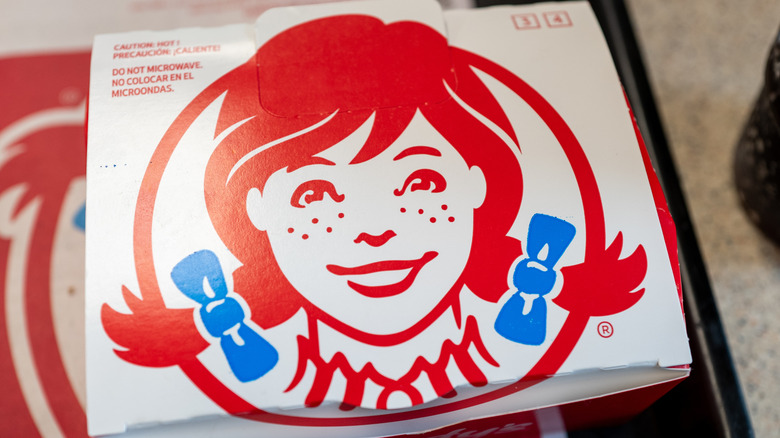
Finally, in 2013, the version we know now appeared. A modernized drawing has Wendy's eyes looking more like real-life eyes, brightening her face. Her pigtails appear to swoop down lower and stick out less, as the blue bows align better with her neckline. Beneath her image is simply the name of the restaurant. And though the company insists that it's unintentional, this version of the Wendy's logo contains a hidden message: The word "mom" on her collar.
