Is There A Hidden Message In The Wendy's Logo?
The first Wendy's menu was only comprised of five items, and while you could enjoy a sweet ice cream treat in the form of the franchise's famous "frosty" and a piping hot bowl of chili, fan-favorite items like the pork-packed Baconator were still just a glimmer in the fast food founders' eyes. Despite the massive menu expansion, the Wendy's logo has remained quite similar across several generations. However, around a decade ago, Wendy's revamped its image, giving a new look to a familiar face.
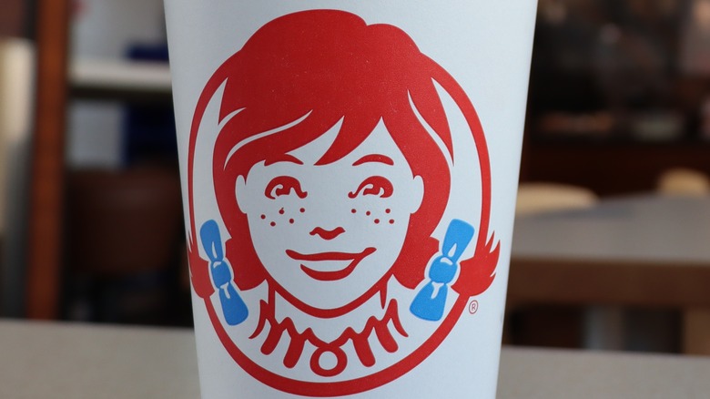
Anyone familiar with the franchise knows that its ubiquitous braided redhead mascot is essentially a homing beacon for fast food aficionados everywhere. However, many readers may not be aware that Wendy's founder regrets the name, as he feels it puts undue pressure on his daughter, who served as the inspiration for the restaurant's red-haired mascot. While bearing in mind the history of the Thomas family-focused franchise, you might be tempted to believe that the new logo's designers managed to sneak the word "mom" into the young girl's dress redesign. In actuality, the "mom" neckline of the dress is nothing more than a happy accident.
A mother's love in every bite
It's no secret how important family was to Dave Thomas. His restaurant, which has become the third largest fast food hamburger chain in the world, is literally named for his daughter, and the logo itself is designed to look like her as a child. However, the hidden "mom" that many restaurant-goers claim to have found in the logo has been roundly debunked by higher-ups in the Wendy's world.
According to Business Insider, though the hidden "mom" can be easily spotted in the colorful version of the logo, it's more readily apparent in the fully red variation of the redesigned logo's ruffled neck, which can be found on the side of Wendy's styrofoam cups. However, if anyone is still on the fence regarding whether or not the "mom" was included intentionally, a high-ranking Wendy's official dispelled the conspiracy theories in no uncertain terms, telling Business Insider, "We are aware of this and find it interesting that it appears our Wendy cameo has 'mom' on her ruffled collar. We can assure you it was unintentional."
The past and present of the Wendy's logo
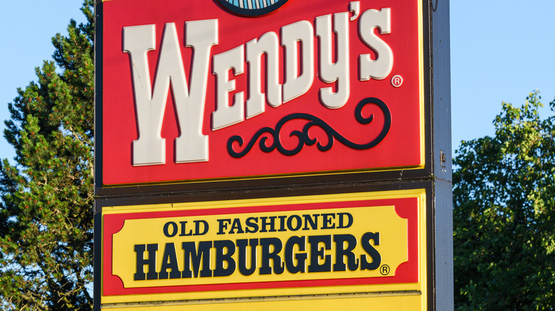
While the franchise's name, which is drawn from Dave Thomas's daughter Melinda "Wendy" Thomas, has remained the same since the first restaurant opened its doors in 1969, the Wendy's logo and messaging have been subject to myriad overhauls. For example, a redesign in the early 2000s dropped the long-running promise of "Old Fashioned Hamburgers" from the logo entirely. The "Quality is our recipe" promise that proudly encircled the young girl's head was not included until the 1971 redesign, and was dropped once again when the newest logo debuted in 2012. The new design has a more zoomed-in shot of Wendy's familiar face, and it also utilizes a more loose, handwritten style for the restaurant's name, in stark contrast to the blocky and bold typeface that previous logos had employed.
Though finding a reference to mothers in the revamped Wendy's logo may be incidental, there are several food logos with hidden messages. For example, a hidden '31' can be found in the "BR" on every Baskin-Robbins ice cream cup, a reference to the number of flavors that the creamery offers. And if you scoop into a jar of Tostitos salsa, you'll see the Tostitos logo has a hidden message too. The second and third 't' of the brand name can be seen enjoying a tortilla chip, dunking it into a salsa bowl situated atop the 'i' — which appears as a yellow triangle.


