Behind The Lens: Color Theory And Understanding Shape In Photography
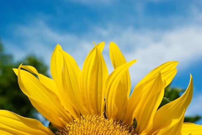
See how the complimentary colors create contrast? Photo courtesy of The Green Party of Ireland.
"Through experience you'll learn what to expect in certain places and situations. For example, in Grand Central Terminal you know you'll see a lot of movement, people annoyed because they're running late, emotions as people say goodbye."
In this week's Photography II class with PhotoUno Photography School in NYC, we're discussing photography and composition, and ways we can tell a story. Our fearless leader Patricia has us begin the class with an exercise to get our brains digesting everything we've learned in the previous classes.
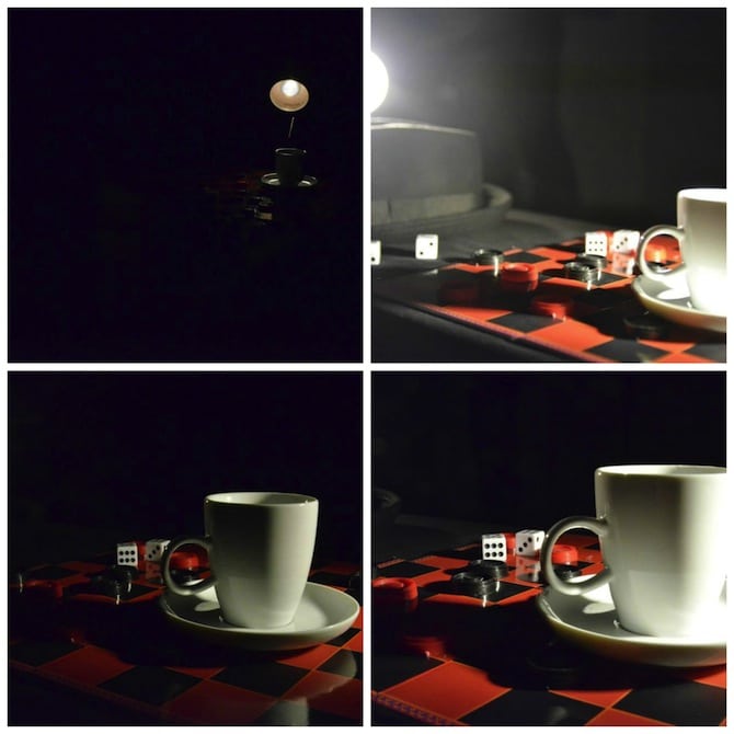
A visual look at how what light you expose for and fine tuning can completely change a photo. Note in the first very dark photo I exposed for the lamp, which made the rest of the photo dark, while in the one next to it having the lamp showing in the photo washed some of it out. The key in this situation is to expose for the highlights but not the lamp directly.
She sets up a tricky lighting situation for us to solve. On a table lit by a harsh bright light she sets out a hat, tea cup and checkers game. We're instructed to set our exposure — ISO, aperture and shutter speed — to neutral as well as our custom white balance. From there, we're asked to take a photo exposing for the highlights and a photo exposing for the shadows, check our histogram and fine tune as needed. After playing around with the situation, I quickly realize exposing for the shadows will make the photo too exposed, while exposing for the light bulb itself will make the photo pitch black as no other illumination in the scene can possibly match it. Instead, exposing for the areas of the table where the light is hitting to gives it a nice glow and deep shadow lines. While the goal is to capture the entire scene, I personally like my photos of just the tea cup.
Color Theory
This gets us into the main topic for the day: color theory and how it can help shape our composition. In a photograph the content is what we see in the photo and the technique is the guidelines that drive our process for getting the photo. Color theory can help improve the overall composition by helping to convey a mood, drawing readers in, telling a time of day or generating contrast or harmony.
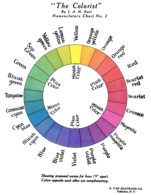
To get us acquainted with color theory we're given a handout showing a photography color wheel. On one side we have warm colors like yellow, amber and orange that are "warm" while on the other side colors like blue, indigo and purple are "cool." It's important to remember that warm colors pop — meaning the viewer's eyes will immediately look at whatever/whoever is that color. Cool colors, on the other hand, naturally move to the background.
To convey the importance of color theory Patricia tells us a story from her experience. One time she was photographing a family: a grandmother, mother and baby. The mother wore grey, the baby wore blue and the grandma wore ... red with yellow flowers. Although the intention was to have the baby be the focus of the photos it was impossible due to the grandmother's warm-colored outfit.
When using colors keep in mind there are a few ways to go about creating a scene. If you want a scene with contrast you'll choose complimentary colors (colors that are opposition each other on the color wheel) like amber and indigo or red and green. Because one makes the other pop, it adds energy to a photo.
On the other hand, you can use analogous colors, or colors that are next to each other like yellow and amber or blue and indigo to create harmony and calm. We practice this going around the room and photographing subjects and scenes based on the color combinations they create. As you can see above, I poised two subjects wearing blue shirts together to create a relaxing feel (looking at it now it would have been better without the other photo edges in the background). Afterward, I play with warm colors popping against cool colors by placing a red bottle in green grass and yellow font against blue fabric.
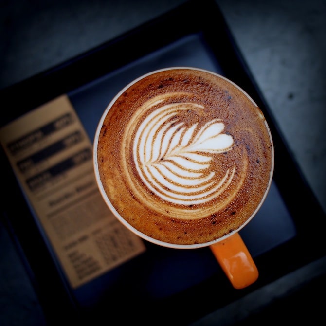
See how this photographer uses shapes to create contrast? The first shape you see is the circle in the foreground; however, there's also a square in the background. Photo courtesy of Takeaway.
Understanding Shape
Another technique Stephanie uses to captivate her viewers is understanding shape.
Explains Patricia, "In photographs, there's always a primary shape that brings unity to a photograph. Sometimes it's obvious, other times it's implicit, like two people looking into each others' eyes in a frame."
In photography, it's appealing to the eye to pick up on patterns of shapes in a photograph. This repeating of a main shape is known as "rhyme." Keep in mind, the repeating shapes don't all have to look exactly the same, but should be the same general shape. Along with the primary shape, a photographer can create contrast with a secondary shape. This is a shape that's not necessarily the first you notice, but it's there, nonetheless, and helps to enhance the primary shape. For extra contrast, a photographer can also add complimentary colors for color contrast and highlights and shadows for tone contrast. When there is shape contrast in a photo this is known as "foil."
"Not every photographer takes shape into consideration, but it's a technique you can use," explains Patricia. "It's not something you'll fully grasp overnight, but practice and it will happen. It's a great tool."
To help she provides us with a tip: think about the negative space. Your subject is the positive space (color doesn't matter here) while what's around your subject is the negative space. Look behind your subject before taking a photo and aim to show a clean negative space that won't compete with the subject. This will naturally create shapes. This negative space can also be used to divide the photo into smaller sections. Additionally, you can create shapes on your own, for example, by having your subject wear polka dots and positioning them in front of a brick wall.
To get us thinking about negative space, we're assigned homework that involves taking photographs of letters of the alphabet. Not obvious letters, but to look for letters in everyday objects allowing negative space to surround the positive and help bring them out. On the way home, I spot an "O" (a ceiling bulb), an "H" (train station poles with sections cut out of the back) and a "U" (a hanging chain). Only 23 more to go! It's interesting how the exercise is already making me feel much more aware of my surroundings.
Do you have a photography tip regarding color, shape or composition? Please share in the comments below.
Also Check Out:
Local Living On Italy's Scenic Amalfi Coast
Behind The Lens: How To Use Lighting For Composition And Storytelling In Photography
The post Behind The Lens: Color Theory And Understanding Shape In Photography appeared first on Epicure & Culture.
