

7 Popular Kitchen Paint Colors From The '50s That Deserve A Revival
We may receive a commission on purchases made from links.
Kitchen trends and designs are constantly shifting. The minute you aim to incorporate a new design into your own, the industry is moving on to yet another concept. Modern kitchen design tends to be highly industrial and sterile, with lots of white and gray colors, and loads of "smart" features and high technology. But if you're the kind of person who finds joy in color (real color, not beigey neutrals), you might want to take a cue from mid-century America, whose kitchens were alive with bright hues. We selected seven that we think would bring a breath of fresh air to even the most modern kitchen.
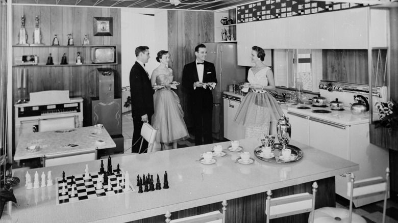
Funnily enough, kitchen colors on television programs in the 1950s were a mystery, as most of these were shown in black and white. But we were able to uncover some old publications and articles that gave us a glimpse of what was celebrated in the fabulous '50s. We noticed a lot of pastels, but some surprisingly bold colors as well. You don't necessarily need to go as bold as painting all your kitchen walls or cabinets with these striking hues; you might opt for an accent wall, inside a breakfast nook (a retro kitchen trend younger generations don't understand), or a few bright accessories. In the end, reviving these colors is all about adding some fun and life back into the kitchen, the heart of the home.
Butter yellow
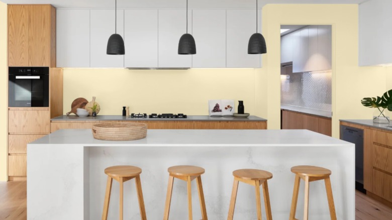
Perhaps the best thing about butter yellow kitchen walls is that it's light enough to act as a neutral, meaning you can easily incorporate rich woods and other colors against it, if you choose it as your kitchen wall color. But this neutral automatically brightens, and warms up any natural sunshine that comes into this room. It's a cheerful hue without being too vibrant. Butter yellow was also popular on kitchen cabinets in the mid-century era, and today, it would be a nice alternative to the abundant white and gray cabinets we see so much of.
Powder blue
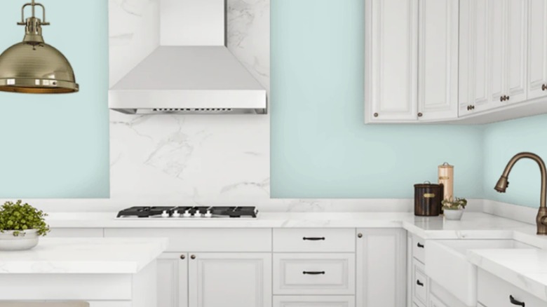
Pastel colors reigned supreme in kitchens in the 1950s, and powder blue was one such color you might have found on the walls, appliances, cabinets or accents. Just like butter yellow brings sunshine into the room, a powder or baby blue brings the sky inside. It's calming, cheerful, and looks great against neutrals, woods, other blues, and with stainless steel or black appliances.
Pastel pink
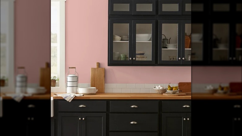
Yet another pastel color that could be seen in several mid-century kitchens, and that is becoming more popular today, is pale pink. If done right, pink can be elegant and sophisticated without making your kitchen look like Barbie's. You can incorporate the color subtly by selecting a super soft hue, or use contrasting tones and neutrals to balance the pink out. And, if you're not keen on pink walls, or large appliances, consider small touches of the cheery color in things like a KitchenAid mixer (there is so much you can use this appliance for) or rare Pyrex pieces in pink Butterprint patterns.
Turquoise
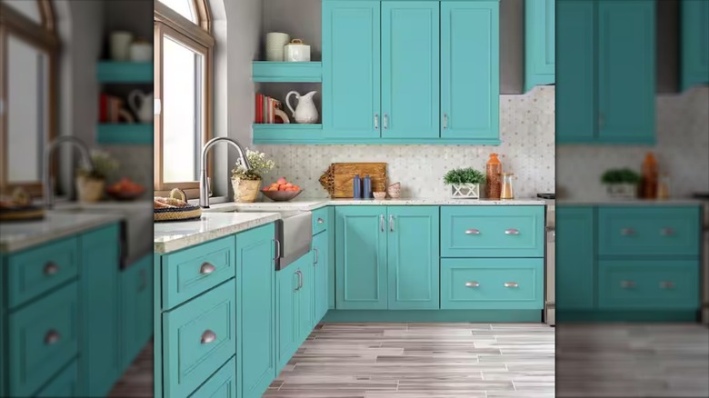
Not every colorful kitchen in the 50s relied on pastels; plenty of people went for bolder colors, like turquoise. They may have incorporated it in with their cabinets, kitchen tables and chairs, or refrigerators. You can do the same things today and the results can be vibrant, gorgeous, and absolutely eye-catching. Turquoise subway tiles on your backsplash is another idea (if you can find them in stick-on form, this is super budget friendly). Or, take anything you've got that's in this blue hue and put them on display, from Dutch ovens to cookbooks.
Chartreuse
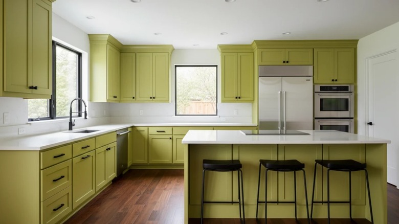
Chartreuse is a very vibrant green-yellow color that you wouldn't necessarily think belonged in the kitchen, but some people in the 1950s loved to make it work. They added pops of this color to their sinks, cabinets, kitchen furniture, and accessories. If you want to start small with this big color, look for barstools and dishes in the hue, tile for a backsplash, or paint the inside of your kitchen door. If you adore how it looks, try an accent wall.
Cherry red
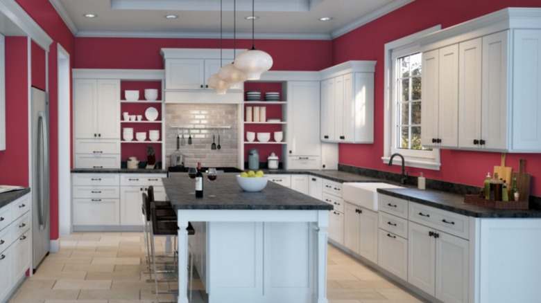
When we think of this hot color in the 1950s, we often associate it with hot rod cars and diner booths. But red was also a very cool color to show off in kitchens. People often wanted to mimic the cozy, fun feel of the era's popular diner culture, blending pops of red with white. There were red appliances, countertops, and more. If you have an otherwise neutral colored kitchen but aren't afraid of color, check out what red can do in the photo above.
Apple green
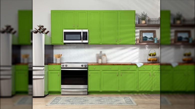
Apple green is not subtle, quiet, or understated. This is an in-your-face color that can make your kitchen look smashing if it's done right. You might have seen the color on kitchen walls in the 50s, or upholstered benches in breakfast nooks. You can definitely make a statement by painting your cabinets apple green, or opt for starting with just your island. This kind of green brings instant freshness and vibrancy into your space.