Under The Golden Arches: McDonald's Logos Through The Years Slideshow
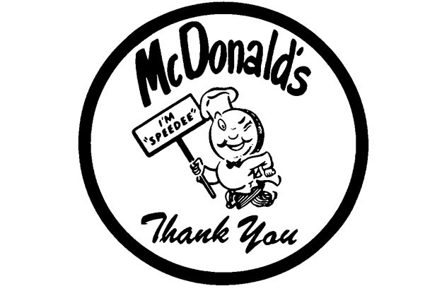
McDonald's first logo featured Speedee, a jaunty, pudgy, winking little chef with a hamburger for a head and a chef's hat. He holds a sign reading "I'm Speedee" just to make sure everyone's on the same page. Wax paper emblazoned with this logo was used to wrap burgers, hence the "Thank You."
1955-1961: Coast to Coast
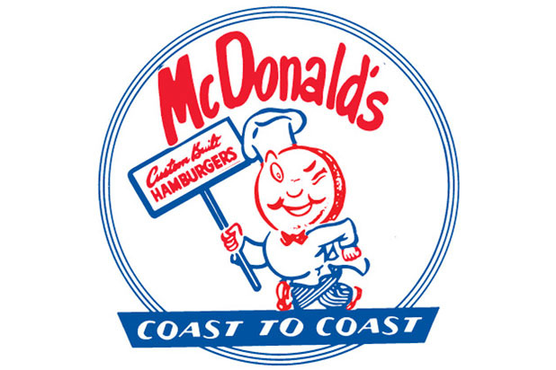
As the chain began to spread, Speedee's sign changed to "Custom Built Hamburgers" and "Coast to Coast" was added to the bottom.
1961: The Arches Appear
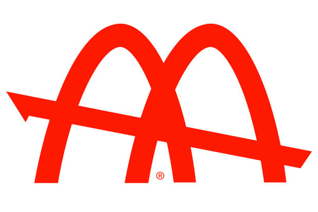
Fred Turner, head of the McDonald's Corporation, sketched the first iteration of the famous "Golden Arches" logo in 1961, after Kroc got rid of poor Speedee in favor or something more universal. The initial arches were interlocking and cross-cut by a slanted line, which was an interpretation of what the earliest McDonald's looked like.
1962: Archy #1
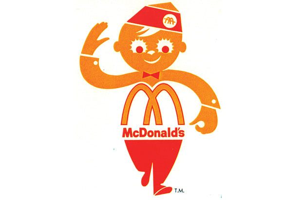
Archy was their second attempt at a mascot, and he didn't last for too long, even though he appeared in the company's first television commercials, dancing around a counter. Archy still lives on in one form today: he still appears on the prestigious Archie Award, given to top students at the company's Hamburger University.
1962: Archy #2
A second version of Archy appeared on the company's packaging, and also didn't stick around for very long.
1960s: The “Slant” Logo
This logo, in colors ranging from yellow to red to black to blue, with and without the name of the company, was the predominant one throughout the 60s.
1968: The Modern Age
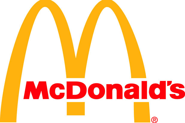
in 1968, Chief Marketing Officer Paul Schrage and ad agency D'Arcy unveiled an overhauled logo, and this is the one that's still recognized around the globe today. This was tied in with an architectural change to existing McDonald's as well; the Space Age-style restaurants were given brick walls and mansard roofs, and the logo that resembled the old style became obsolete. This streamlined design appeared with and without the company's name, as it does to this day.
1986: The Red Rectangle
In 1986, the logo was surrounded with a red rectangle for packaging, advertising, and promotional purposes.
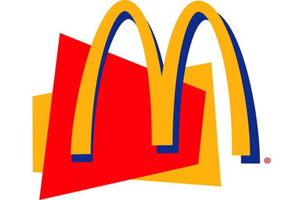
1992: Something Different
This logo was rolled out in 1992, and tacked the arches on top of a red rectangle bearing the company's name.
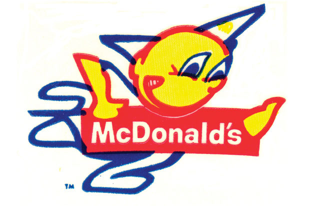
1996: The “Super M”
The "Super M" logo was unveiled in 1996, and rimmed the golden arches with a blue shadow over geometric gold and red shapes. Today it brings to mind their official sponsorship of the '96 Olympic Games and the failed Arch Deluxe.
1971-Present: The International Logo
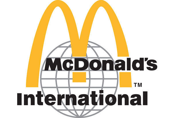
There's a completely different corporate logo used around the world, and it's the official one for McDonald's International. You won't see it inside actual restaurants, however.
Today: I’m Lovin’ It
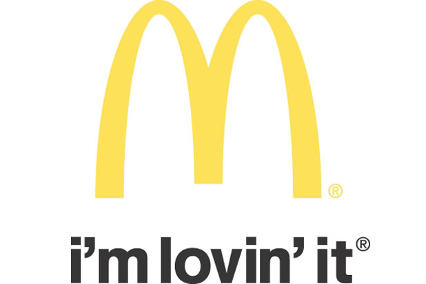
The official logo today comes in a few shapes and sizes, but they all involve a stripped-down yellow arch and the official motto: "I'm Lovin' It." We've come a long way from Speedee, and today the golden arches are much more than just a corporate logo, they're a cultural touchstone and a symbol of America's global influence.