Here's How The Olive Garden Logo Has Evolved Over The Years
Olive Garden gets a lot of heat for its take on Italian fare — but arguably, the casual Italian-American chain is better understood as its own, unique establishment. You don't go for a genuine taste of Tuscany; you go for endless breadsticks and obscenely good deals on copious amounts of pasta.
Love it or hate it, Olive Garden has been a part of our cultural canon for over 40 years, and with something like 900 locations across the U.S. and beyond, it's hard to deny the brand's impact or popularity. Though the world has changed dramatically over the last several decades, Olive Garden's concept of approachable, Italian-inspired food in a family-friendly setting has more or less stayed constant. The way that it has evoked this in its marketing and branding materials, however, has subtly shifted over time.
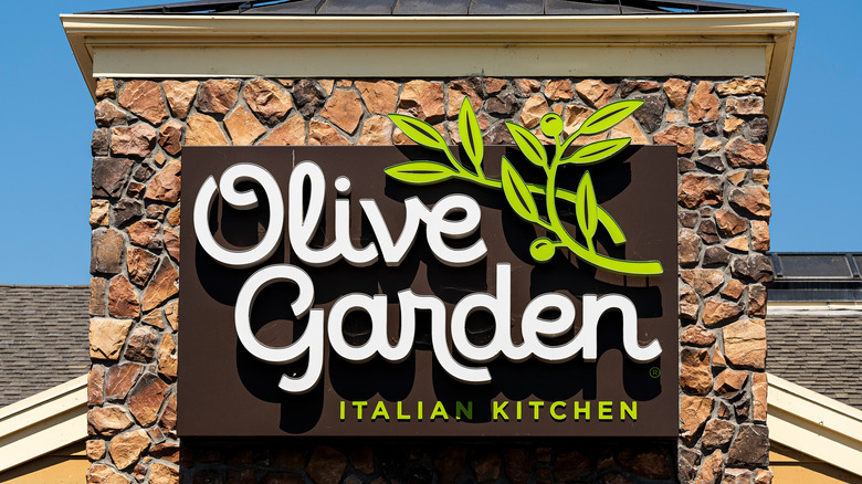
If you've been to, or even just driven by, an Olive Garden anytime in the last nine years, you'll probably recognize the current logo. It consists of the brand name in white, loopy script on a brown background, with a simple illustration of an olive branch and the words "Italian Kitchen" at the bottom. Though the general aesthetic concept has remained pretty consistent, the actual execution and final look of the logos has changed quite a bit through the years.
The Olive Garden's earliest logos
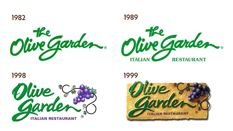
When the first Olive Garden opened up in 1982, in Orlando, Florida, the logo was a simple handwritten-style script reading "the Olive Garden" in kelly green. The casual, fairly minimalistic look gestured toward elegance. That logo remained until it was tweaked in 1989 when the brand added the words "Italian Restaurant" in small, capitalized letters beneath the name.
The next change didn't come until 1998 when it got a pretty significant facelift. The kelly green signature got a slight drop shadow, giving it a little more contrast and legibility, and the words "Olive" and "Garden" were stacked on top of each other to make room for an illustration of a bunch of grapes on swirly vines in the logo's upper right corner. The "Italian Restaurant" text lost its serifs and turned purple to match the grapes. Most significantly, "the" was dropped from the beginning of "Olive Garden." So if you ever hear anyone refer to it as "the Olive Garden," know that they're not exactly wrong — they just stuck to an old habit.
Just a year later, the logo got another dramatic makeover. The basic composition stayed the same, but the whole design became much more fleshed out, with detailed shading and a stucco-like golden brown background. If you're old enough to remember the turn of the millennium, there's a good chance that this is still the logo that comes to mind when you think of Olive Garden.
The modern Olive Garden
When the brand switched to its current logo in 2014, it turned out to be pretty controversial (or at least, as controversial as a pasta chain changing its logo can be). The move was part of a total brand overhaul in response to lagging sales, and the new look included redesigning restaurants. The slightly schlocky imitation of Tuscan architecture was traded for a cleaner, minimalist interior and exterior.
Despite Olive Garden's design being shaped by both quantitative and qualitative research, the public response was pretty unimpressed. A number of business journalists and customers alike found the new logo's clean lines and loopy cursive to be generic and bland and not really evocative of a restaurant at all. The company held firm with its rebranding though, and the logo has remained for nearly a decade now.
Business has been pretty good for Olive Garden over the last few years, not only having returned to but exceeding pre-pandemic sales figures, so there's no reason to believe the company will attempt to reinvent itself again anytime soon. That's tough luck if you're part of the crowd that vehemently hates the current logo, but hey — you can always toss that branded takeout bag aside, close your eyes, and take a mental trip back to the '90s while munching on your leftover breadsticks.


