The Clever Reason Sprite Bottles Have Dimples
You have to give the Coca-Cola Company credit. Its advertising executives are masters of marketing and know how to make its products both easily recognizable and desirable. The corporation also learned a hard lesson in its early years about the use of unique packaging to protect its market share.
The brand's classic bottle design was created for precisely these purposes. According to the Coca-Cola Company website, the introduction of its "hobbleskirt" bottle was initiated for two purposes. One was to make the bottle recognizable by touch: In the early 1900s stores often sold Cokes from tubs full of ice water, making it difficult to see the bottle itself.
The other was to make it more difficult for competitors to counterfeit and infringe on the company's rights. A patented bottle design made it nearly impossible for companies like Ma Coca-Co, Koka-Nola, and Toka-Cola to stay in the game (per Quartz). Knowing this bit of history, it should come as no surprise that when Coke brought Sprite to the United States in 1961, they would adopt a similar strategy (Via Rock Hill Coca-Cola).
Sprite didn't start out as a soda
Coca-Cola's original Sprite wasn't even a drink but instead a character used in the company's advertising campaigns. According to Rock Hill Coca-Cola, the original Sprite was a white-haired elven kid that wore a Coke cap for a hat. The company's advertising campaigns featured this character from the 1940s until 1958 when the mascot was discontinued.
Sprite the drink came into being due to supply shortages in post-war Europe. Via Snack History, Coke was forced to develop alternative drinks due to supply chain issues, something we can all relate to. Because they couldn't make traditional Coke products, the company created a fruit-flavored line of drinks called Fanta. Sprite was originally called Fanta Klare Zitrone (via YouTube). This roughly translates to Clear Lemon Fanta.
Snack History tells us that in the late 1950s, 7 Up had begun to make inroads in Coke sales, so the company decided to bring its own version of a citrus drink to American shores and introduced Sprite in 1961.
Rather than start building brand recognition from scratch, the company decided to bring back the Sprite name, which was still very popular with consumers. After many focus groups and marketing strategy meetings, Coke decided that the new drink needed a new bottle and chose green as its color. This was partly because it presented as being a more natural alternative to sodas and root beers, but mainly because it would be instantly recognizable.
Bubbles, bubbles everywhere
Along with creating a bottle that set it apart from the competition, Coke went back to the company's roots and decided to design a bottle that would be totally unique to its brand. They had a name that people already loved, a bottling network that guaranteed them market saturation, and more than enough of a marketing budget to build brand recognition instantly. The last piece was a bottle that would both be recognizable by touch and prevent competitors from poaching on their success (via Snack History).
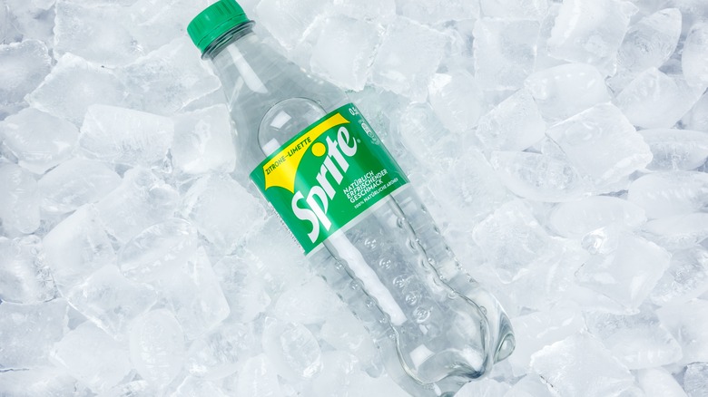
The solution to achieving these dual goals came from the drink itself. Obviously, Sprite is a carbonated drink. It pops when you open the top, and tiny bubbles rise through the clear liquid. It was from these bubbles that the designers gained inspiration for the bottle design. Per Rock Hill Coca-Cola, the dimples in the container are meant to replicate the look of the bubbles that are released when the bottle is opened.
We can't be sure if it is the dimples or that Sprite allegedly helps with hangovers (via UPI), but you can't argue with success. According to Snack History, Sprite is now the third-ranking soft drink in the world. Meanwhile, Coca-Cola has added several new flavors to its lineup.