The Tostitos Logo Has A Hidden Message
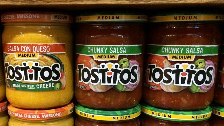
Tostitos tortilla chips are a well-known staple of parties, and an open Tostitos bag sitting beside the salsa bowl has been a common sight at casual get-togethers since the 1980s. Frito-Lay, who owns the popular crunchy chip brand, is very aware of this reputation, and if you look closely at the Tostitos logo you can actually see a small party scene playing out before your eyes.
At first glance, the chips-and-dip brand logo seems straightforward: "Tostitos" is written out in black letters, while the middle 'i' is dotted with a red circle beneath a small yellow triangle. But just like other logos containing hidden messages, there's subtle symbolism at play here. Once it's clear that the yellow triangle resembles a tortilla chip, suddenly you can also see that the red dot is a salsa bowl and the two 't's are actually two people dipping the chip in salsa. It may seem a little complicated to explain in words, but the graphic in the logo captures the fun energy of a game night or birthday party.
Looking back on the Tostitos logo
Tostitos' logo is fairly recent, considering how long the brand has been around. The recipe itself dates back to Rebecca Webb Carranza in 1940s Los Angeles, who took discarded tortillas from the factory she owned, cut them up into triangles, and then fried them as party snacks. But the Tostitos name first appeared in 1978, as a new triangle-shaped chip from PepsiCo subsidiary Frito-Lay, which sells potato chips, corn chips, and other supermarket snack foods.
The original Tostitos logo was a simple one, written out with simple black text in a rather formal serif font — although the red dot above the 'i' was always there. By 1985, Tostitos was now one of Frito-Lay's top-selling products, and the logo was redesigned with a less serious, more festive flair. It stayed this way for about 18 years until the logo got a complete overhaul in 2004. Then, "Tostitos" had an even funkier font with asymmetrical letters and a bright orange and yellow background behind it. At this point, the secret scene of two partygoers dipping chips in salsa was added, and the red dot of the 'i' took on a new meaning as a salsa bowl. The logo was revised again in 2012 into a slightly more minimalist design, but the secret image remains.
Why brands include hidden images in logos
"The practice of hiding elements is common to all visual communications, not solely logo," Paul McNeil, a typography professor at the London College of Communication, told CNN. The trend of hiding witty visual puns and secret images became popular in the 1970s, and it's based on Gestalt psychology, which focuses on the human brain's ability to pick up on patterns in simple shapes — in this case, the brain's ability to look at the stylized image of the word "Tostitos" and see two people eating tortilla chips.
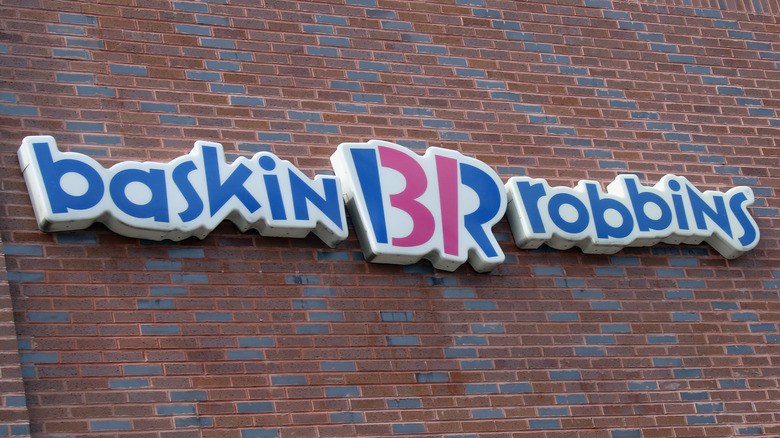
Do these sorts of secret images, such as the hidden 31 in the Baskin-Robbins logo, or the secret kiss shape in the Hershey's Kiss logo, actually help with sales? The Harvard Business Review describes logos as "descriptive" if they contain info about their product, or "non-descriptive" if they don't. They ran an experiment with over 170 startup logos and found customers were almost always more interested in buying from companies with descriptive logos.
Fitting a stylized descriptive graphic into a logo is difficult, but very effective. Even if everyone doesn't always spot the hidden image, the discussion around these sorts of "easter eggs" can be a useful tool for advertisers. Plus, once you're in on the joke, it's impossible to unsee it.


