Why Some Menus Don't Include The Dollar Sign Next To The Prices
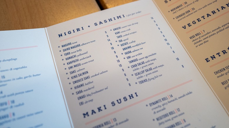
Have you ever noticed that some restaurant menus are missing the dollar sign next to the prices? That's not just a design choice or a typo; there's a psychological effect behind the decision. The absence of the dollar sign is a subtle tactic employed by restaurants to encourage customers to spend more. When prices are presented without a currency symbol — for example, 20 instead of $20 — it minimizes the association with money, making the numbers seem less significant and reducing the perceived cost.
This phenomenon is scientifically proven, too. A team of researchers at Cornell University studied the effects of restaurant menu dollar signs on patrons and found that the currency sign reminded diners of the "pain of paying." Without the visual reminder, diners are more likely to lead with their appetites. In the study, diners spent an average of $5.55 more at restaurants that did not list their menu prices with a dollar sign.
The same study also tested the difference in spending behaviors when confronted with numeral price formats versus scripted prices (20 or $20 versus "twenty dollars"). The team found that menus with scripted prices resulted in less spending than the numeral price formats, although it's unclear why. The moral of the story for restaurant owners: Using numerals without currency symbols yields the most spending per patron.
Menu engineers and the little mind tricks that boost spending
Luckily, restaurant owners don't have to craft their menus solo. Among positions such as flavorists and other awesome food jobs, the market for menu engineers and consultants is booming as business owners seek out their expertise to optimize menu design and pricing strategies. They analyze consumer psychology, market trends, and the restaurant's specific goals to create menus that drive profitability and enhance the dining experience. These experts use techniques such as menu layout optimization, strategic pricing, and item placement to influence diners' choices and increase sales.
For example, prices that end with .95 are perceived as "friendlier" than .99, according to Gregg Rapp, a menu engineer and consultant, who told The New York Times that prices with .99, such as $29.99, can come off as gimmicky or trite. The experts also recommend nixing the price trails (the line of dots leading from a menu item to its corresponding price) as they serve to accentuate the cost of an item. Price columns are also discouraged because they place all the prices in a stack and make it easier for diners to simply choose the cheapest item.
Other menu moves that play on your psyche
But menu psychology isn't all about price formats. There are many forms of subliminal messaging and subtle moves to lure customers to the high-ticket items. One common technique is the use of decoys, which are intentionally-included menu items that are strategically priced high to make other options seem more appealing. For example, a restaurant might offer a high-priced steak as a decoy to make a slightly lower-priced seafood dish seem like a better value.
The top right area of the menu is prime real estate for high-profit items since that's where the eye naturally tends to fall. Using visual cues like boxes, borders, or images helps draw attention to certain dishes, while descriptive language can help evoke emotions or highlight the freshness and quality of ingredients and entice diners to order them.
Restaurateurs also use a "golden ratio" to avoid overwhelming customers with too many menu options. This ratio recommends roughly seven options per category. This seems to be the sweet spot to avoid what psychologists call the "paradox of choice," which says that too many options can leave consumers feeling dissatisfied.


