18 Food Logos With Hidden Messages
We may receive a commission on purchases made from links.
There are some logos out there that are pretty iconic. Most of us can probably think of a few of our favorites off the top of our heads, whether that's McDonald's golden arches or the Coca-Cola logo. Yet most people simply don't pay all that much attention to food logos on a regular basis, as they're too busy enjoying the food itself.
Have you ever wondered whether secret messages or meanings are hidden in your favorite food and drink logos? We dug deep and discovered 18 food and drink logos with hidden messages.
Some of these aren't really that hidden, and you've probably spotted some of them before. Others will require you to really look closely to spot the hidden message. Whether you're aware of them already or not, all of them are sure to wow you. Check them out and discover how many of these hidden messages you already know about.
1. Toblerone
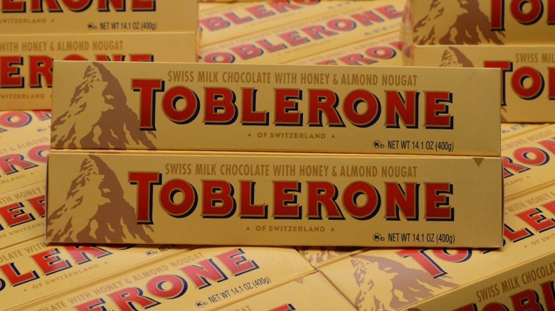
Toblerone is a popular chocolate bar now made by Mondelēz International. The chocolate company was initially founded in Bern, Switzerland, a city also known as the "city of bears," which is important for a very good reason.
At first glance, the Toblerone logo looks familiar and pretty simple. Chunky red and yellow lettering spells out the brand name, with a picture of a mountain next to it. But look a little closer.
There's a bear hidden in the mountain! A closer look reveals it rearing up on its hind legs, something you might never have noticed before unless you were paying attention to the logo. This is a pretty cool hidden image and pays homage to the origins of the sweet treat.
2. Baskin-Robbins
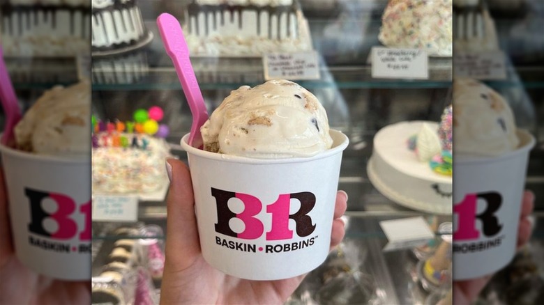
Here's one hidden message in a food logo that we never spotted before — and now that we've seen it, we can't unsee it. Perhaps you've noticed it before?
The pink and chocolate brown Baskin-Robbins logo has a cleverly hidden number 31 in pink located in the center of the logo. This refers to the time in the past when Baskin-Robbins had just 31 flavors of ice cream. The company wanted its customers to try a different flavor every day of the month.
Of course, Baskin-Robbins has far more flavors to choose from today. In fact, it has over 1,400 flavors in its library. We think it's still pretty cool that the brand has stuck with the idea behind its original logo.
3. Twix
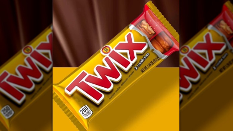
There's a bit of a story behind the Twix logo. At first glance, you'll spot the word "Twix" in red and white, with a brown shadow said to represent the chocolate treat inside.
What you may not have noticed, however, is that the dot for the letter "I" has two lines, rather than the usual single dot or line. There are lots of imaginative stories about what this represents, including one story saying it fits the brand's "Pick a Side" campaign. However, the logo has featured the two lines above the "I" since 2010, and Twix's campaign only launched in 2012.
So, what's the real reason for the two lines? It turns out that it's actually a pause button, representing the need to slow down, take a break, and enjoy your Twix.
4. Wendy's

Wendy's is the place to head for comfort food that makes you feel at home. So, it makes sense that the brand has tried to bring back nostalgic memories of childhood with its iconic logo.
The logo features a little girl with red hair wearing a white colored shirt. At first glance, you might think the collar has blue markings. Take a closer look, though, and you'll spot the word "Mom" cleverly hidden in this collar.
Coincidence? Though we'd say definitely not, a spokesperson for the brand debunked the story, saying that the fact that "Mom" is spelled out on the collar is unintentional, according to BrandCrowd. Either way, it's not putting us off a trip to Wendy's for a Baconator.
5. Orbit
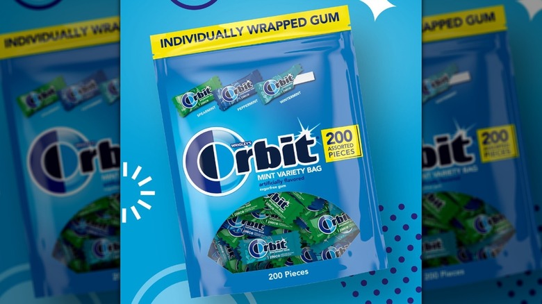
Orbit gum has been produced by Wrigleys since 1890, and its logo is pretty iconic. The logo has been through many iterations over the years, but in its current form, the "O" in Orbit is made up of two semicircles: one dark blue and one light blue. The two blue semicircles were first introduced in 1976, though the logo has changed a bit since then.
This seems like a colorful design choice at first glance, but there's more to it than that. Apparently, the dark and light blue semicircles symbolize Earth's orbit around the sun throughout the night and day. That's pretty cool!
6. Nestlé
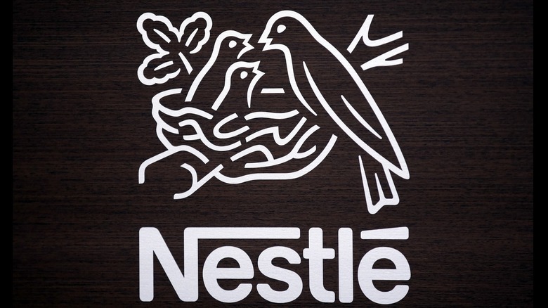
This next logo might surprise you. While it's not on all Nestlé products, some of the company's products feature a bird's nest as part of the logo. The bird's nest has been a part of the logo for over 150 years since the company was founded in 1866, though the logo has changed several times since then.
If you're wondering why, that's because Henri Nestlé, the company's founder, incorporated this imagery from his family's coat of arms, which featured a bird in a nest. There's even more reason for it than that, though. In Swiss, the word "Nestlé" means "little nest."
7. Burger King

This food logo isn't exactly a hidden message. In fact, it's pretty obvious. The Burger King logo features the company's name in red, but the words are nestled between two burger buns, making the logo represent a burger.
The logo of this fast food restaurant didn't always look like this, though. When Burger King was established in the United States in 1953, the logo was black and white, with an image that looked like a sun rising. It wasn't until 1969 that this logo was launched. It's stood the test of time, with minor changes since then.
8. Subway
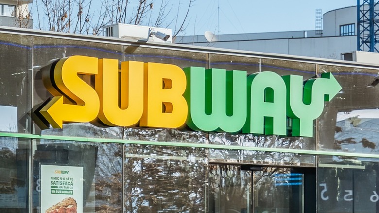
There is another hidden message in the Subway brand's logo. Generally, you're so hungry when you make it to Subway for a sub that you may not even have noticed it. Or is that just us? The yellow and green logo has the first and last letters indicating the entrance and exit of a subway. That's pretty cool.
Subway's logo didn't look exactly like this when the company arrived on the scene in 1965, as "Pete's Super Submarines." It wasn't until 1970 that the iconic arrows at the start and end of the word made an appearance. Since then, it's undergone some minor changes, with the current yellow and green colorway being introduced in 2016.
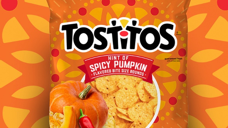
9. Tostitos

If you're observant, you may have already spotted the hidden message on every bag of Tostitos. If not, you'll have to look a little harder.
The two "Ts" in the middle of the Tostitos logo are actually two little people enjoying chips and dip. The "i" between them is a bowl of salsa (the red dot) on a table. Now you've spotted it, you'll never look at Tostitos the same way again!
Back in the 1970s, the original logo was simpler than the one we're used to today, without the hidden message. This iteration (with a few changes) arrived on the scene in 2003.
10. Hershey's Kisses
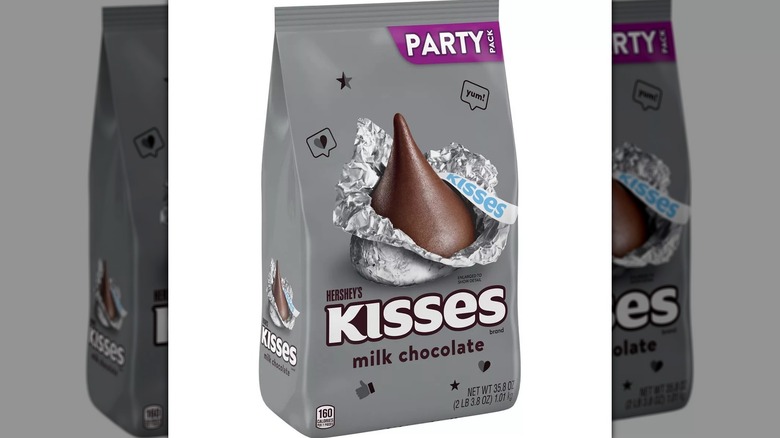
Hershey's Kisses has a simple logo. It appears to have nothing hidden within it. Looking at the white writing of "Kisses," which is on a brown background for the classic version of the candy, nothing seems apparent.
But wait! Turn your head slightly to the left and look between the "K" and "I" and you'll see another Hershey's Kiss. Who knew?
This hidden Hershey's Kiss is pretty clever, and if you didn't know it was there, it's all too easy to miss. It's been around since the early 1970s when the logo looked a lot like it does today — even the fonts used are the same.
11. Heinz Ketchup
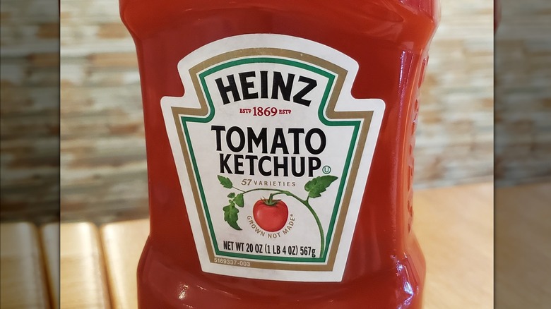
This hidden message is one that you probably never noticed. Every bottle of Heinz Ketchup has the number "57" on it. While you might think this means Heinz produces 57 varieties of sauce, this is in fact a myth.
Heinz doesn't currently and has never, produced 57 varieties of sauce. There are actually hundreds of varieties. So where does the number 57 come from?
The story goes that when Henry John Heinz, the company's founder, visited New York in 1896, an advertisement advertising "21 styles" of shoes caught his eye, and he decided it would be a good way to engage his own customers. Supposedly, five was Heinz's lucky number, with seven being his wife's lucky number. Other stories say that Heinz simply chose the number seven as it stood out to him.
12. Chick-fil-A

Chick-fil-A's logo may not hold any hidden secrets, but it's still clever enough to get a mention on this list. Looking at the bright red logo, you can instantly see the hidden chicken in the first letter "C." Not only is this eye-catching, but it lets consumers know exactly what type of food you can find at Chick-fil-A.
The logo has changed a bit since the company was founded back in the early 1960s, but it's always included a chicken at the start in some shape or form. The very first logo had a cartoonish drawing of a chicken before the letter "C."
13. Starbucks
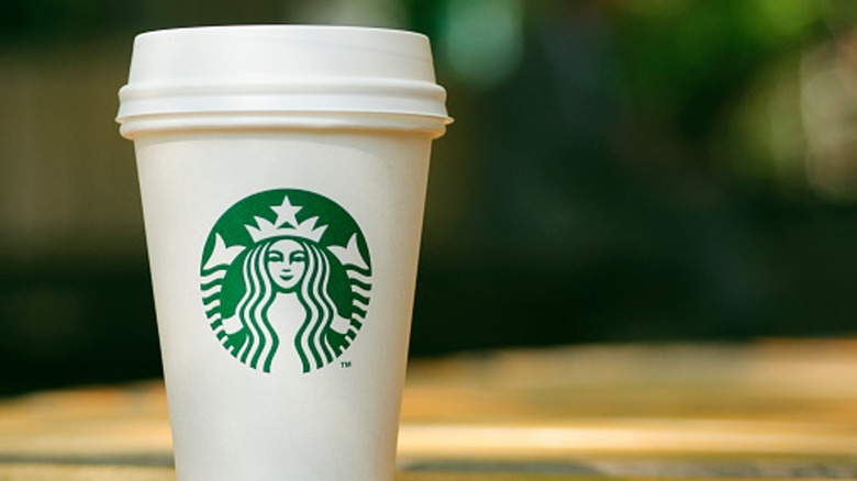
How many times this week have you given in to your Starbucks craving? It's many people's favorite place to get coffee, but have you ever stopped to consider its logo?
The creature in the center of the green and white Starbucks logo may look like a mermaid, but it's actually a siren. The logo itself was supposedly found in old marine books.
This makes sense when you consider that Starbucks was founded in Seattle, a port city. The beans used to make coffee are also generally transported by sea in large container ships.
The original Starbucks logo, which was used from 1971 to 1987, actually featured a black and white twin-tailed siren. It wasn't until 1987 that the green and white was added to the logo.
14. Taco Bell

The bell in Taco Bell's logo isn't really hidden. It's only there because, well, the restaurant's name contains the word "bell," right? There's actually a much more interesting story behind the logo.
Glen Bell was the creator of the iconic brand. Before creating Taco Bell, Bell owned various other restaurants throughout the 1950s, such as Bell's Drive-In and Taco Tia in San Bernardino, California. It wasn't until 1962 that Taco Bell itself was launched.
The bell didn't even feature in the original logo, which started out using colorful letters and no imagery at all. By 1985, though, it was an integral part of the brand's identity.
15. McDonald's
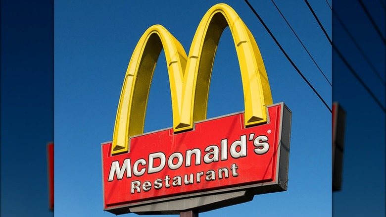
The McDonald's logo is one that's instantly recognizable. The iconic dual golden arches are simple, right? There's no hidden meaning there. But it turns out that the story behind the logo is a bit weirder than you might expect. Apparently, the golden arches are supposed to symbolize a pair of female breasts, suggesting maternal love, according to design consultant and psychologist Louis Cheskin.
The story goes that McDonald's planned to ditch this iconic logo in the 1960s, but Cheskin persuaded the brand that the golden M's looked like a mother's breasts, which would draw customers to the restaurant. With an early advertising slogan for McDonald's stating: "Give Mom a night off," this starts to make some sense.
16. Domino's
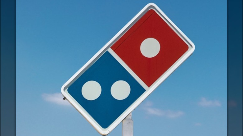
Domino's is one of those logos that everybody knows. The blue and red domino with white dots is instantly recognizable. But did you ever wonder why there are three dots on the domino?
When Domino's first created its logo in 1965, only three locations existed. The original logo was just a red and white domino, with blue writing added in 1969. The actual domino itself didn't become blue and red until 2012.
Originally, Domino's planned to add a new dot every time the company opened another location. As you can imagine, though, that quickly became impossible, as the chain expanded worldwide.
17. Pepsi
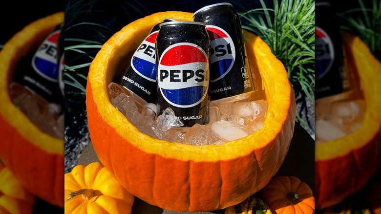
Pepsi has an iconic logo that's been through its fair share of changes over the years. Chances are, though, you've never put much thought into why it consists of a simple circle with three wavy sections in red, white, and blue.
The colors red, white, and blue are representative of the American flag. That wavy design is said to represent feng shui, the Earth's magnetic field, the theory of relativity, and a whole lot more.
The logo has actually been through 13 different iterations since it was conceived in 1893 when Pepsi was originally called "Brad's Drink," named after its creator, Caleb Bradham, a pharmacist from North Carolina. The very first logo for the drink was blue and white. By the time it became known as "Pepsi-Cola" in the early 1900s, the logo was red and white. The trademark blue wasn't added back to the logo until the 1950s.
18. Hershey's Krackel

Though Hershey's Krackel was sadly discontinued in 1997, it keeps popping back up from time to time, and you can still find miniatures of the chocolate for sale online. Chances are, if you remember this sweet treat from your childhood, you don't remember much about the logo. Most of us were too busy getting the chocolate from the packaging into our mouths to focus on its design.
You might never have noticed the hidden crack running horizontally through the center of the Krackel logo. Or maybe you spotted it and didn't care because the chocolate was just too delicious. Who could blame you? It doesn't seem to have any hidden meaning other than relating to the brand name and product.