Who Is The Woman In The Panera Logo?
Some famous food mascots, like Little Debbie, the Gerber Baby, and KFC's Colonel Sanders, are actually based on real people, according to History. These famous figures have been basically immortalized in the images of their company's logos. However, while some companies take their insignia inspirations from the people around them, others are completely made up. After all, as much as we might love seeing Tony the Tiger on our cereal boxes, the boisterous cartoon was the pet project of advertising executive Don Tennant, not a rendition of a real-life feline, reveals the Los Angeles Times.
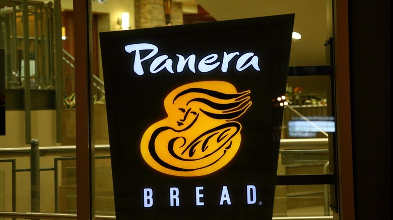
However, between the two extremes of crafting animated personas and modeling after flesh-and-blood individuals, there exists a kind of company logo middle ground. Some brands, while they don't depict real-life images, still want to convey a real sense of warmth, friendliness, and familiarity with their customers through their logos. And what could be warmer and more familiar than the Panera Bread logo? Featuring a woman cradling a loaf of bread in her arms as her long locks of hair flow in the wind, this logo was designed specifically to evoke feelings of comfort and closeness, as well as allude to the actual bread-making process. And while it may have undergone a few changes over the years, this underlying message has stayed the same since the company got its start in 1987.
The woman in the Panera logo is known as Mother Bread
Panera Bread was founded by Ken Rosenthal and his wife Linda under its original name, the St. Louis Bread Company, according to Reference for Business. It got its start as a single bakery-café located in Kirkwood, Missouri. Rosenthal set his establishment apart from the competition thanks to his deliberate technique for making quality sourdough bread; the budding entrepreneur had studied sourdough baking in San Francisco, and he brought that expertise back to his Missouri business.
Rosenthal was devoted to the quality and freshness of his bakery products, and the company logo represented that commitment. The original symbol featured a line drawing of the long-haired woman holding a loaf of sourdough; she would come to be known as Mother Bread. The meaning behind the image was twofold: First, Money Inc. explains, fresh sourdough bread is baked using a starter, a small piece of dough that is added to the batch to help it ferment. This starter is also called a "mother," and Panera's logo is meant to show Mother Bread carrying the starter to the bakery — the same starter used since 1987, Panera claims — to make the next batch of fresh sourdough.
Secondly, the maternal figure, who holds the starter like a loving mother might hold a baby and whom the company Twitter affectionately calls "mom," conveys the warmth, comfort, and contentment that customers hopefully feel when they dine at Panera.
The Panera logo has changed over the years
The St. Louis Bread Company was acquired by the Au Bon Pain Company in 1993. In 1997, as the company expanded, the bakery-café changed its name to Panera Bread in order to foster a broader appeal beyond its home state, according to Reference for Business. Over the years, the Panera Bread logo and design have changed slightly, although the original concept has remained largely the same. In 2005, details Taste of Home, a yellow background was added to the logo to give it a warmer glow, and the font was changed in 2011. The shortest-lived alteration came in 2019 when the company briefly updated the logo to remove the woman's flowing hair and replace the loaf of bread with an armful of wheat, but it returned to the old, welcoming standby after just one year.
More recently, in 2020 a green arch was placed behind Mother Bread, who now looks directly at the viewer. The arch, whose color Taste of Home explains is meant to symbolize Panera's commitment to whole, natural ingredients, represents the mouth of the oven where one might bake fresh bread. Without a doubt, the logo has changed a lot over the years, but the evolution was ultimately meant to foster and enhance the same feelings of warmth, comfort, and freshness that the first logo did decades ago.


