The Worst Color Serving Bowl To Use For A Salad
When it comes to good food, first impressions count. Keenly aware of this, both home and professional chefs grind away, endeavoring to provide the perfect, harmonious presentation to highlight a delectable culinary creation and laboring over everything from the position of each side dish to the placement of the final garnish. But the reality is that perfect plating is sometimes as simple as selecting the right color dishes on which to plate and serve your food.
Yes, even the wrong color salad bowl can make or break how your guests perceive your food and whether or not they dig in excitedly. With a seemingly abundant number of dish options on today's market, the key to the perfect presentation of a fresh, crisp seasonal salad is to use the right color bowl to provide a positive association with consuming them and stay away from colors that bring out their worst characteristics. So when it comes to the best color to serve salad in, red is out. That's right, leave those holiday bowls for your holiday sides.
The best and worst colors for your salad bowl
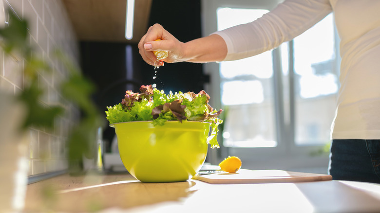
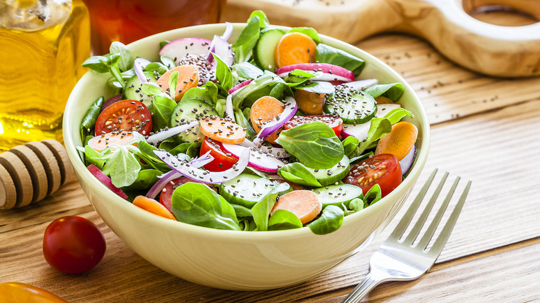
For a flawless salad presentation highlighting the freshness of your crisp greens, look no further than the color yellow. Yellow is the most suitable color for presenting salads and fresh vegetables in the best light — literally — as it resides next to green on the color wheel, meaning the two colors share pigments and create a warm, seamless visual. In fact, any color between yellow and blue — whose hues are both present in green — would feature salad greens beautifully. According to Chef Kevin Ashton, who stressed to Food Matters Live that there are definite rules to plating your food and that the color of your plating has a subconscious effect on how you perceive and consume it, "greens and blue are more targeted to healthier and fresher foods."
Wondering which colors to avoid? Since red and green are complementary colors, they provide a contrast that is too prominent, unlike the analogous pairing of green and yellow. Further, according to Ashton, red represents indulgence and impulse, which opposes a bowl of fresh greens. Perhaps the most notable point against a red salad bowl is that the color red tends to reflect into the food, which would detract from your greens' fresh appearance. So, when presenting a beautiful, appetizing salad, stick with a safe choice between yellow and blue.
Other best — and worst — colors for your food presentation
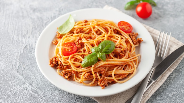
Your greens aren't the only food that can benefit from intentional color plating. Your beef, red sauces, and other red-hued food — such as tomatoes or beets — should be plated on white to maximize their presentational impact. Red is a bold color that pops already, so there's no need to add more colors to the mix — let that spaghetti shine on its own by featuring it on a blank white canvas. Worried about pesky red stains on your pristine white dishware? You can clean with all-purpose baking soda by sprinkling some (and be generous here) and a few drops of water on your dish after you're finished eating, spread it, and let it sit for a few minutes. Then, you should be able to scrub those stains off easily. But if you decide to plate your red food on a colorful dish, stay away from green. Green will accentuate the cool tones of a warm red and make a cool red look harsh, all adding up to a seriously unappetizing dish.
Additionally, neutral-colored foods — such as chicken or alfredo — can appear bland, so they should be served on black and brown dishware and never lighter neutral colors. When it comes to desserts, the general rule is to match the color of your dish with that of your garnish, so if you're serving cheesecake with a raspberry garnish, invest in some party pink dishes and make Barbie giddy.