The Story Behind The McDonald's Golden Arches Is Amazing
The famous McDonald's golden arches are without a doubt the most legendary corporate logo in the world today, and are even recognized by more people than the cross. But we bet that you don't know the story behind this simple and perfect symbol for the ubiquitous chain.
Most corporate logos are focus-grouped and field-tested, and go through rounds and rounds of trials before being rolled out. A logo needs to be immediately recognizable and needs to instantly evoke the company behind it, which is no easy feat.
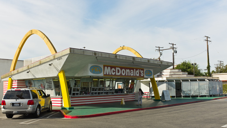
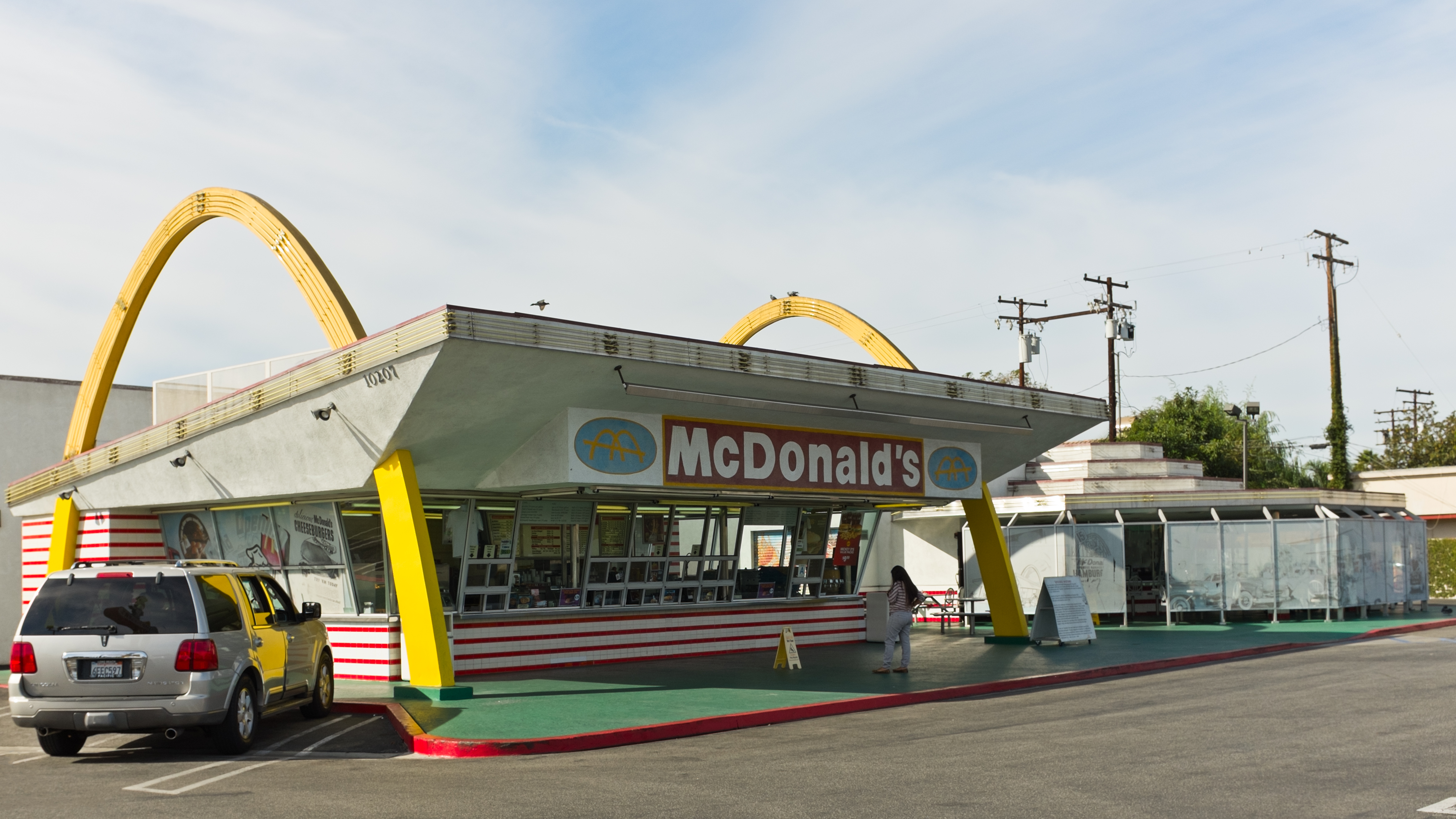
The "Golden Arches" were originally two separate arches located on either side of the super-modern (at the time) buildings constructed by the founders of McDonald's, Dick and Mac McDonald. All original McDonald's locations had these arches on either side, and they were the brainchild of none other than Mac McDonald. Believe it or not, when the brothers were interviewing architects to design the first location in 1952, they were met with a fair amount of resistance. The first architect was adamantly against incorporating the arches into the design, the second wanted to change them too much, and the third didn't want to be told what to do. In desperation, the brothers sketched out a rough approximation of what they were looking for – a building with a half-circle on either side – and brought it to an architect named Stanley Clark Meston, who streamlined the arches into tapered parabolas. The design stuck, and the end result was revolutionary for the time.
When McDonald's decided to do away with the design in the early 1960s, design head Jim Schindler took his inspiration from thoe already-famous arches to design the earliest version of the company's logo (below): an abstract view of a McDonald's location from an angle, with the two arches lined up to form an "M" and the roof bisecting it. Over the years, it morphed into the logo we recognize today.