The World's Best Snack Packaging
The World’s Best Snack Packaging
The package that our favorite snack comes in is something that we tend not to give much thought to. Its primary function is to just tell us the name of the product, after all, and maybe a little bit about its nutritional content and ingredients. But when was the last time that a snack's packaging really made you take notice? These nine packages certainly will.
Fit Buns

This Ukrainian company produces high-protein bread with a coupon for a free gym visit inside every box. How appropriate (and funny), then, for the box to feature a guy lifting his shirt to reveal washboard abs — which are actually the buns inside the box.
Bla Bla Cookies

Designed by students at a Moscow school of art and design, this cylindrical container features a cartoon face. You open it up by peeling away the flap where the mouth is, revealing a mouth full of cookies.
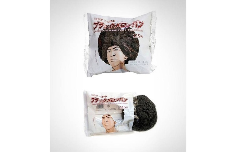
This Japanese Cookie
We're not exactly sure what this company is, but the fact that the clear cellophane makes the cookie inside look like an afro cracks us up.
Momo’s Meals

These organic soups, stocks, and risottos from Australia come in easy-to-use pouches that are really, really well-designed. You can see what's inside, the typeface is bold and big, and fun illustrations show off the ingredients.
Coppeneur Chocolates

This German chocolate company might have the best-designed chocolate box in the world. It looks like a sleek black box with a green sleeve, but when you slide the box open it turns into its own little table, proudly displaying the chocolates inside. Smart!
Food Should Taste Good

This all-natural snack brand was acquired by General Mills in 2012, and might just have the best packaging in the General Mills portfolio. The black border, the individual chip with its dark shadow, the solid white background, the minimalist and elegant text... they all communicate that this is a high-end chip.
Quinn Popcorn

This "farm-to-bag" popcorn company is working to disrupt the pop-at-home popcorn industry in a big way, starting with its packaging. There are no chemicals or heating elements, and each package actually contains three paper bags: the plain popcorn, oil, and flavoring. To communicate that this is a popcorn company like no other, Quinn's packaging is simple, hand-drawn, and monochromatic. It communicates that, like the product, it doesn't need to be flashy to be good, and doesn't look like any other popcorn box on the scene.
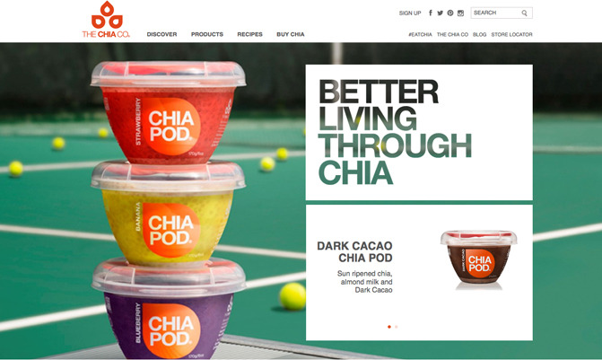
Chia Pod

Chia Pods contain chia seeds mixed with fruit and coconut milk. Its packaging is made from 30 percent recycled material and is 100 percent recyclable, and each container really is its own little pod. The font is bold and easy to read, and also somehow retro. The icing on the cake, however, is the little built-in spoon on the top of each container. These guys could have just put their product in a standard yogurt container, but instead they invested something completely unique.
San Carlo Potato Chips

This Italian potato chip company's packaging is simple to the max, and we love it. There's a light background, a photo of the product with a deep shadow, and as little text as possible. Yet somehow, it still communicates everything you need to know about what's inside.